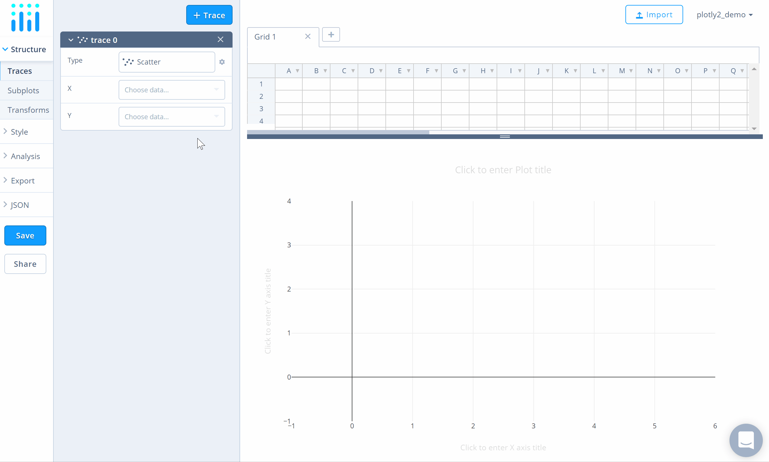
Grouped Bar Charts
A bar chart presents grouped data with rectangular bars. Bar lengths are proportional to the values that they represent, and can be plotted vertically or horizontally.
Try an Example
Before getting started with your own dataset, you can check out an example. First, select the 'Type' menu. Hovering the mouse over the chart type icon will display three options: 1) Charts like this by Chart Studio users 2) View tutorials on this chart type 3) See a basic example.
Clicking the 'See a basic example' option will show what a sample chart looks like after adding data and editing with the style. You'll also see what labels and style attributes were selected for this specific chart, as well as the end result.
You can also use the data featured in this tutorial by clicking on 'Open This Data in Chart Studio' on the left-hand side. It'll open in Chart Studio.
Add Data
Head to Chart Studio and add your data. You have the option of typing directly in the grid, uploading your file, or entering a URL of an online dataset. Chart Studio accepts .xls, .xlsx, or .csv files. For more information on how to enter your data, see this tutorial.
Create Chart
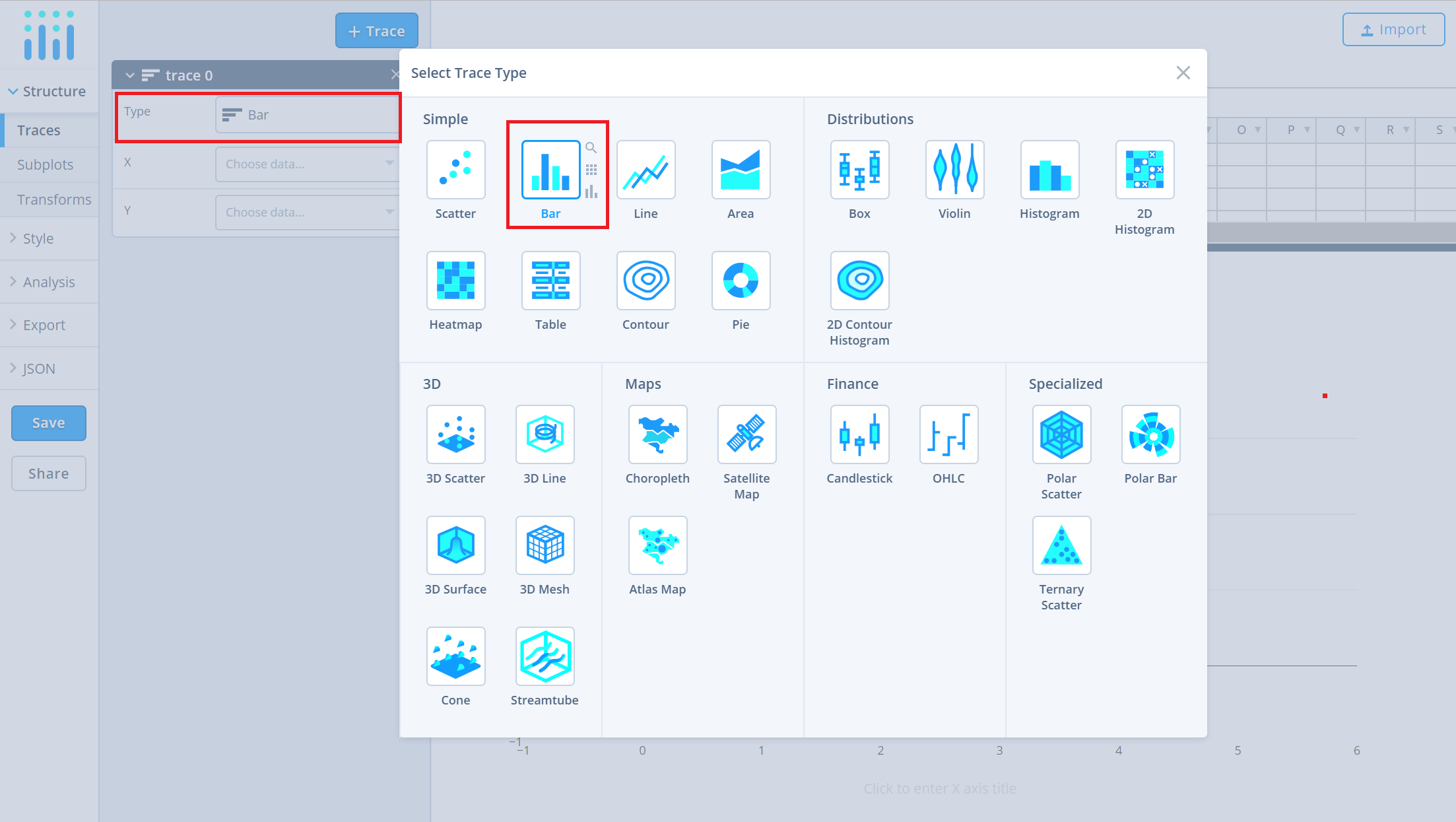
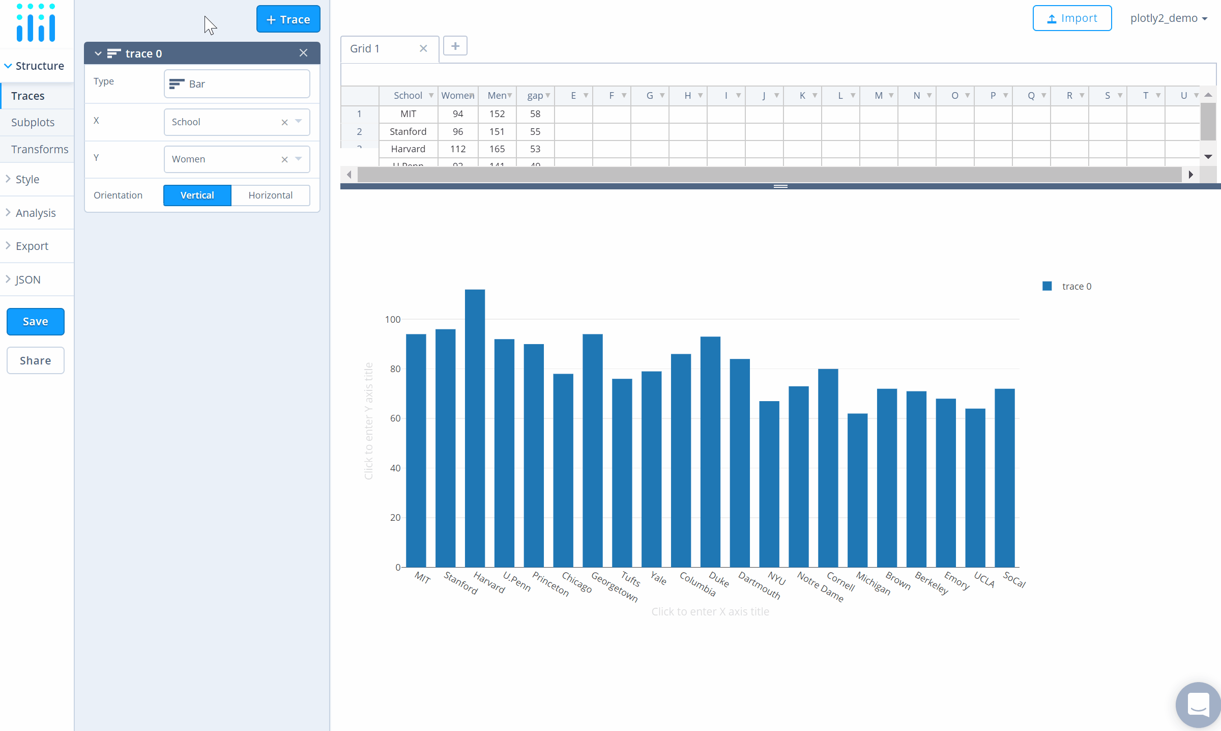
After adding data, go to the 'Traces' section under the 'Structure' menu on the left-hand side. Choose the 'Type' of trace, then choose 'Bar' under 'Simple' chart type.
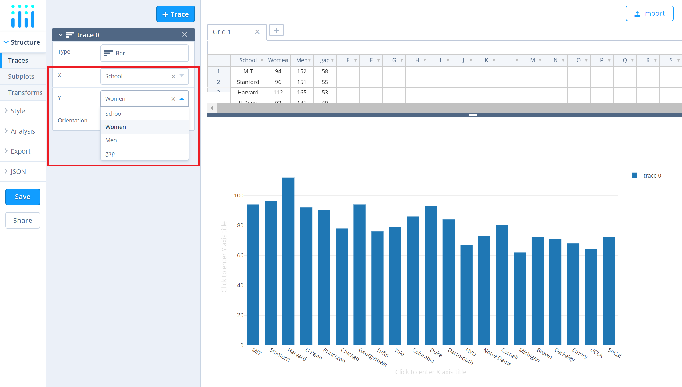
Next, select 'X' and 'Y' values from the dropdown menus. This will create a bar trace, as seen below.
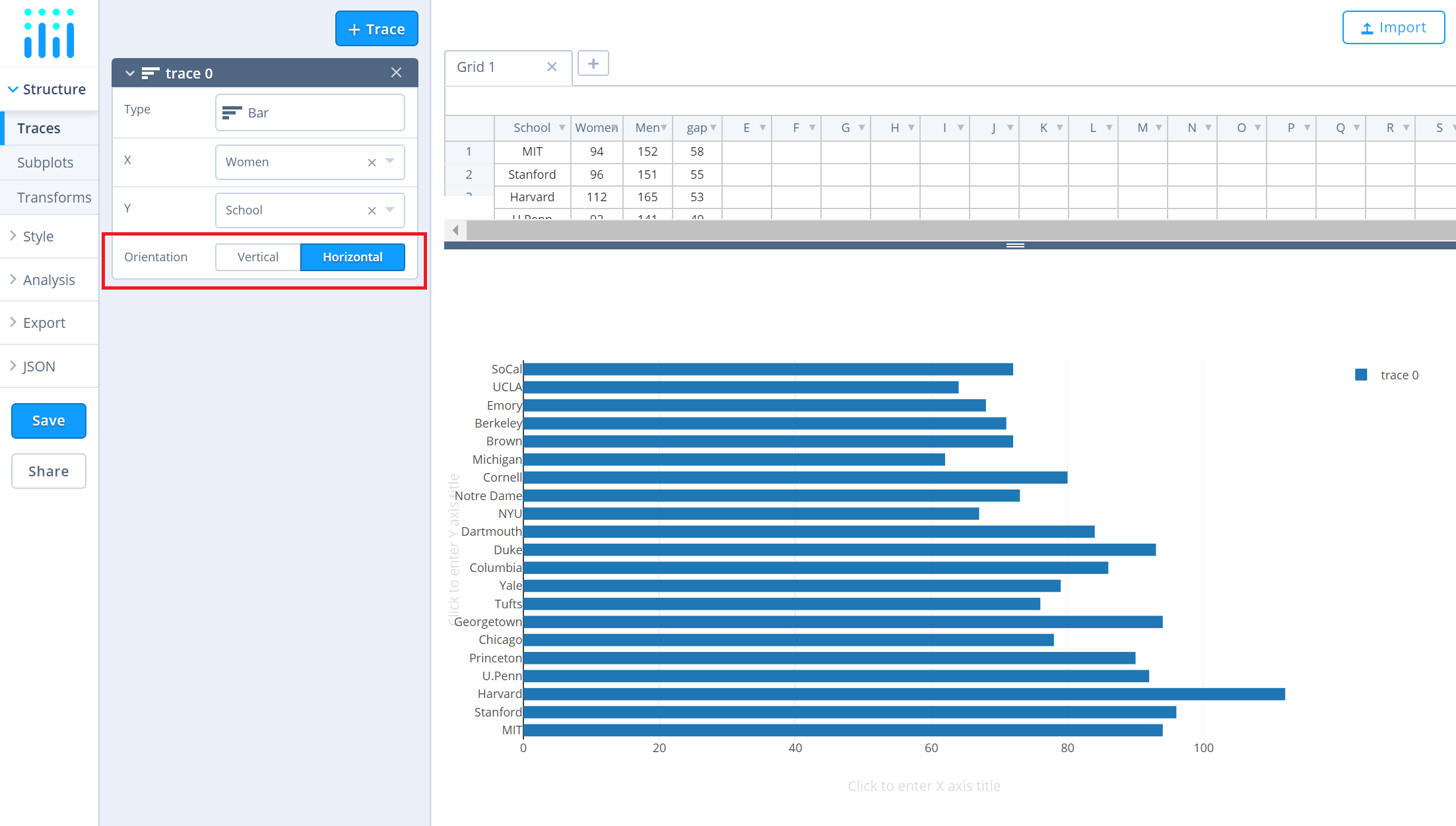
Then, choose the desired orientation for the bar trace. 'Vertical' is chosen by default. Here is how the above chart looks like when 'Horizontal' is chosen as orientation.
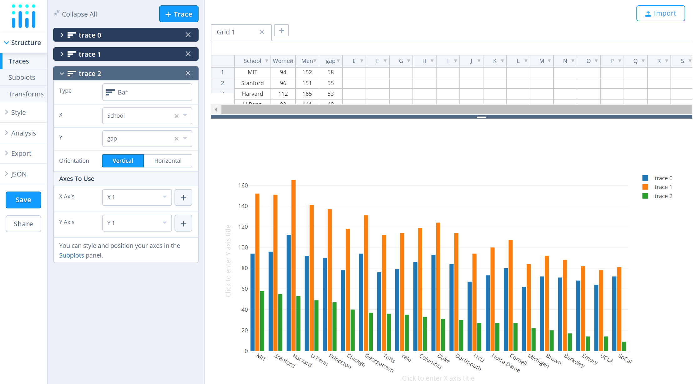
To add more traces to the plot, click on the '+ Trace' button at the top right corner of the panel in the 'Traces' section under the 'Structure' menu.
Add as many traces as needed until the plot is complete!
Style Chart
The 'Style' menu displays many options for modifying characteristics of the overall chart layout or the individual traces. To see more options about styling the chart, visit the style and layout section of the Chart Studio documentation.
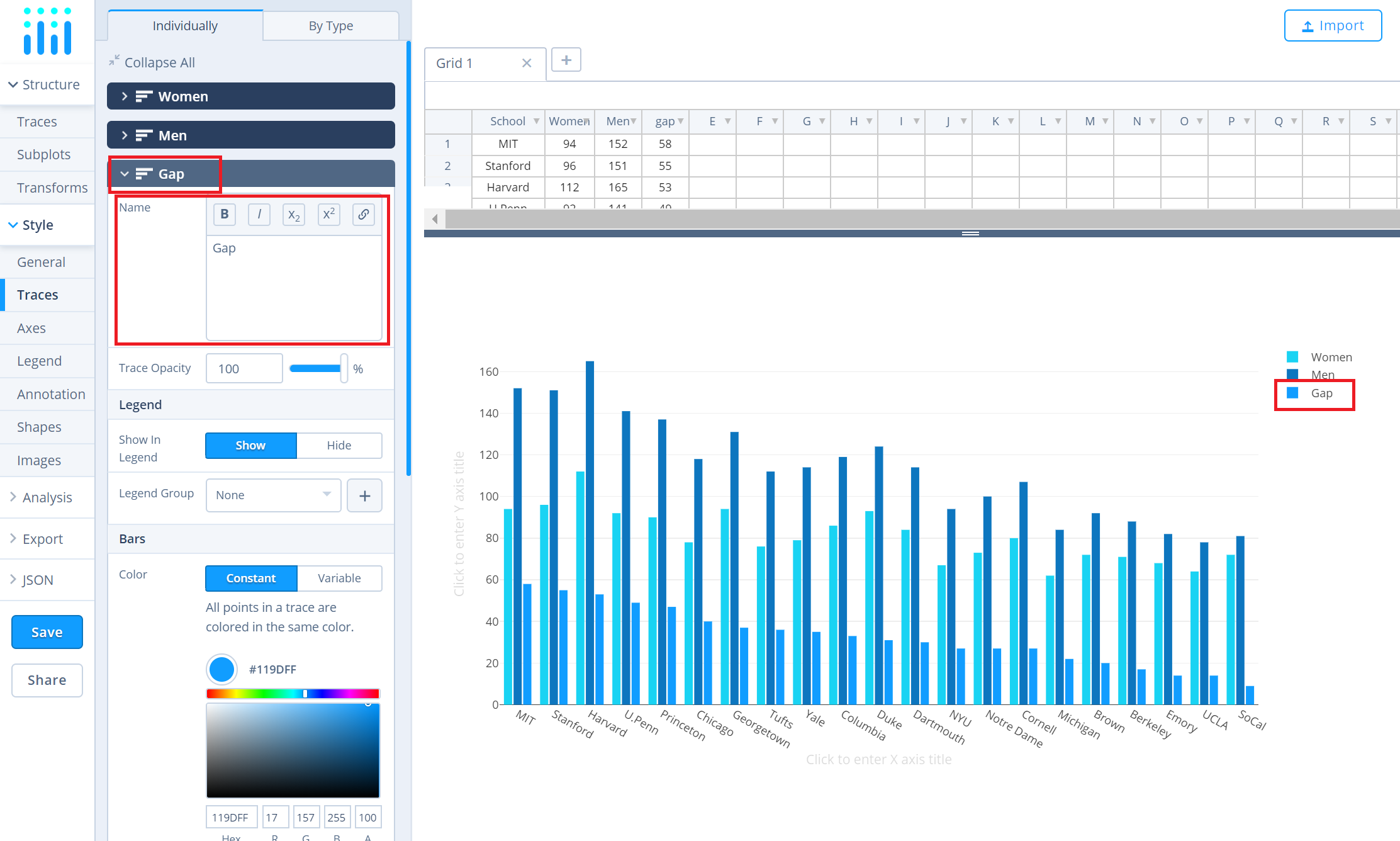
To change the properties of the bar traces, such as trace name, bar color, or size and spacing, go to the 'Traces' section under the 'Style' menu.
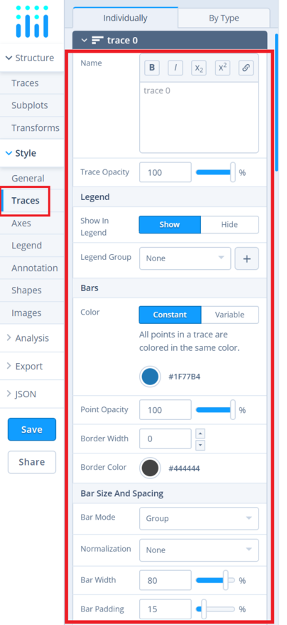
Note that updating the trace name will update the legends as well.
To set the plot title, go to the 'General' section under the 'Style' menu and type in the plot title within the textbox provided under 'Title'.
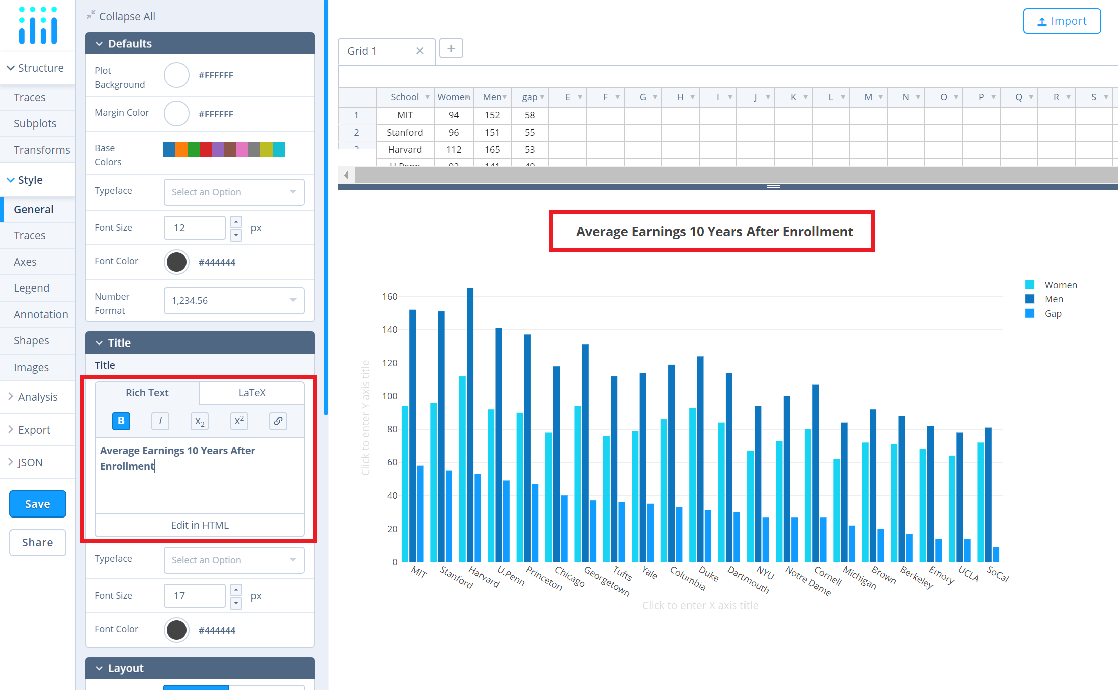
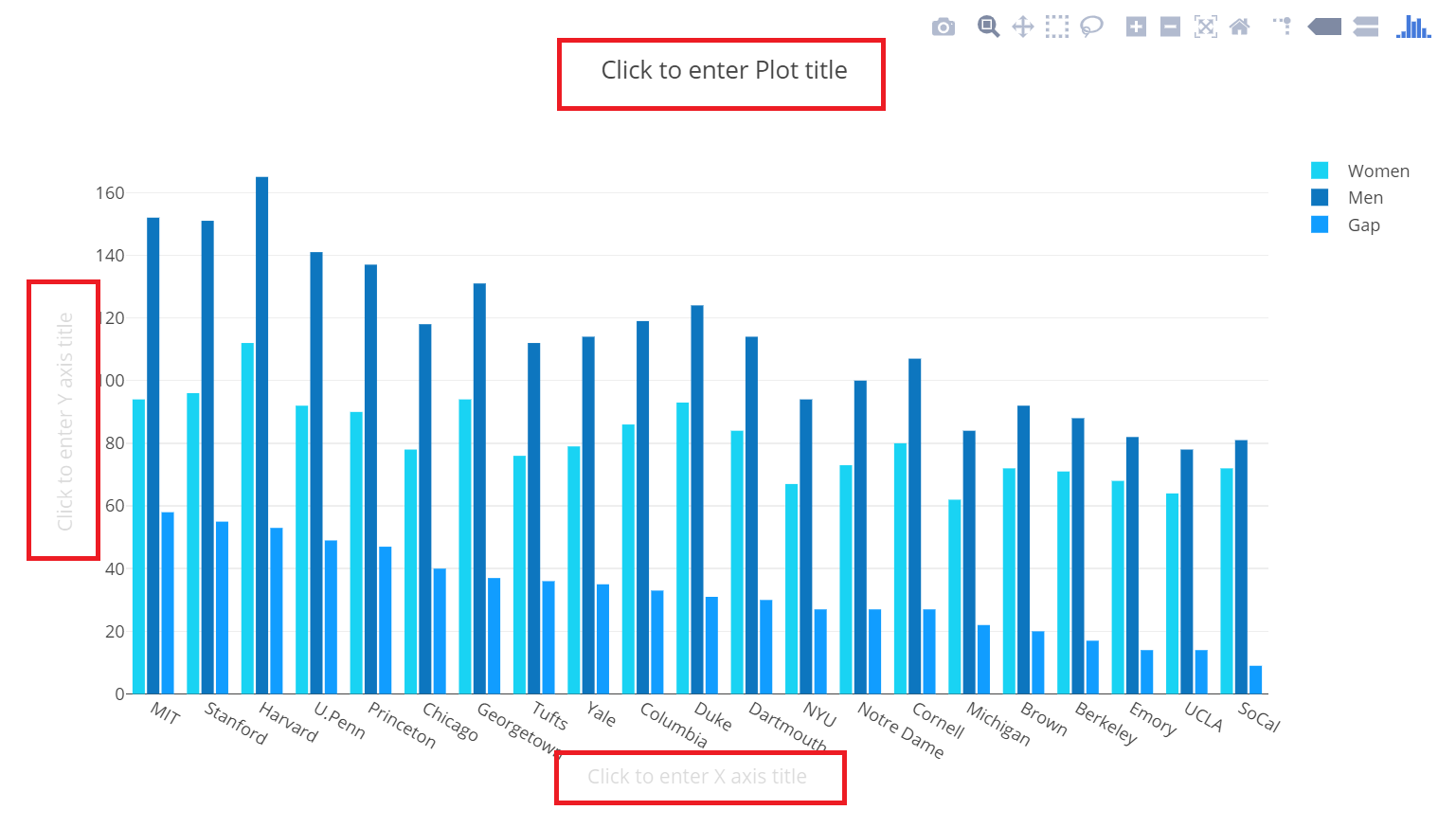
Another approach is to click and then enter the title directly on the plot interface. The same can be done for the axes title and the legends.
Save and Share
To save the plot, click the 'Save' button on the left-hand side. A save modal will appear, as seen below, where you can specify the filenames and privacy settings for your plot and data grid.
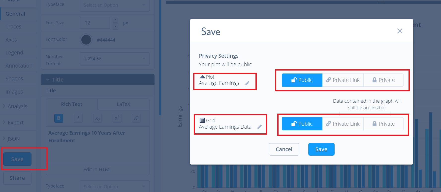
For more information on privacy settings and how sharing works, visit Chart Studio's sharing tutorial.