Style Your Plots in Chart Studio
How to style your plots.
Getting Started
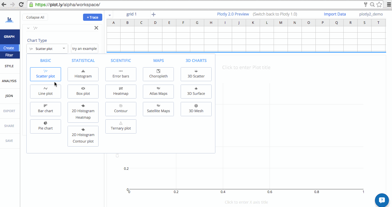
You've added your data, you've chosen your chart type, but how do you style your plot?
For this styling tutorial, we'll be looking at different chart types and using various examples. If you've chosen a chart type but don't have specific data to work with, click the 'try an example' button to get a sample chart.
The STYLE section
Once you've opened your workspace and have your data in the grid, you'll have to do a few things to make your plot look just the way you want it.
The STYLE section on the right-hand side of your workspace is where you'll spend most of your time styling your plot.
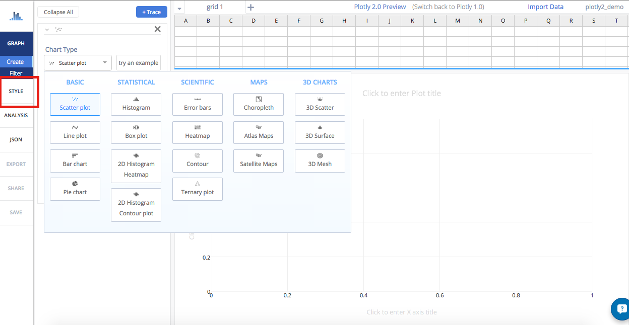
Click on STYLE to open that panel. Each chart type is unique with its own attributes, so each section under the STYLE tab will have different selections depending on the chart you choose.
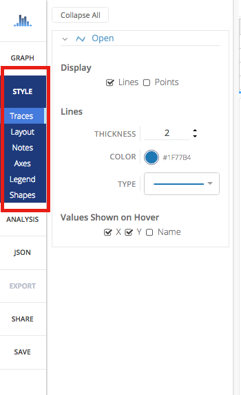
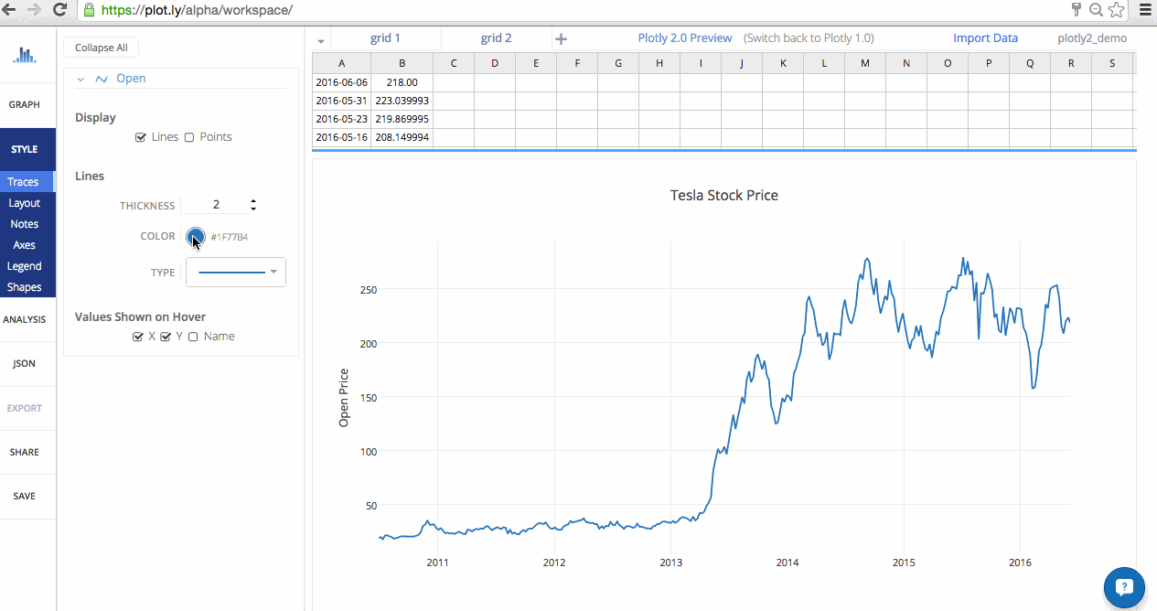
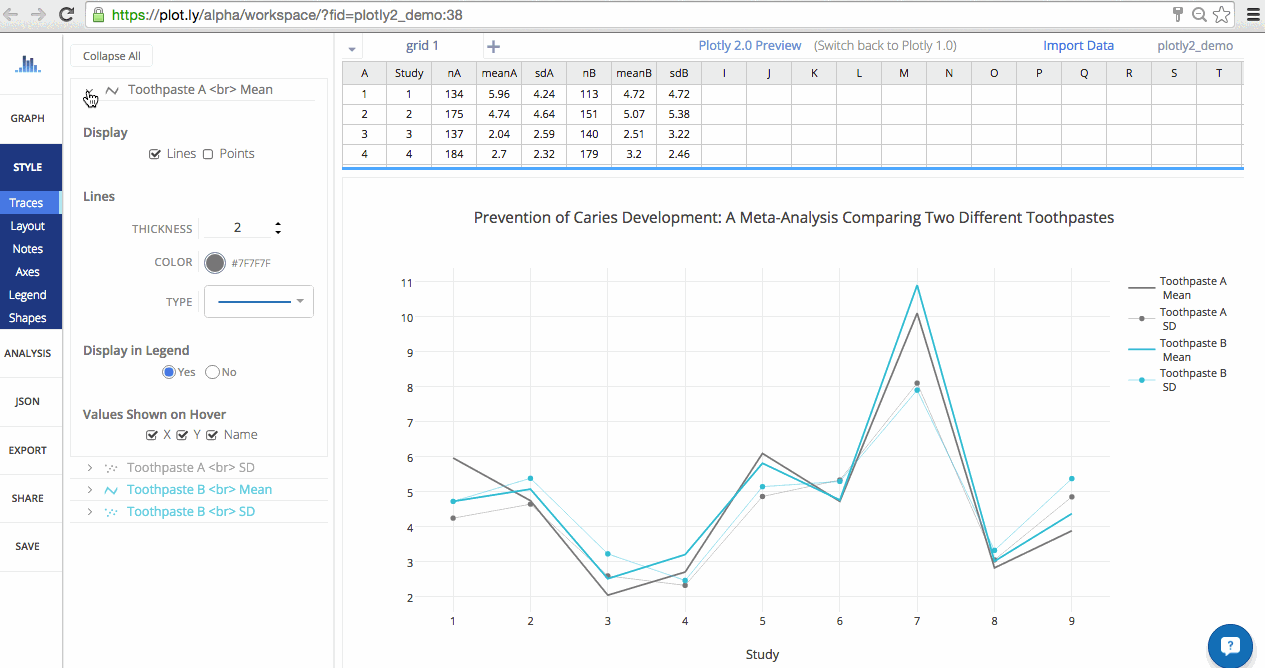
Traces
The 'Traces' tab is a section to edit style attributes of the chart's values or data. For basic plots such as line and scatter, this is where you change the color and thickness of your lines. You can also play with the color, diameter and symbol of your points.
Your lines don't have to plain straight ones! Click on the TYPE dropdown to see the different dashes to spruce up your plot. The same can be done in a contour plot.
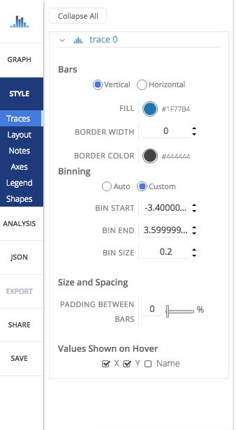
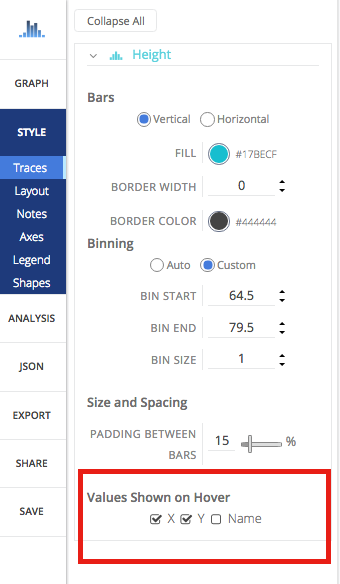
If you're working with a bar chart or histogram, this is where you can change the size and spacing between each bar, as well as the bin size (the width of each bin on the number line) of your histogram. The two images below are examples of this.
For plots that contain a colorscale (i.e. scatter plots, contour plots, heatmaps, choropleth maps, and 3D charts), this is where you'll find it. The heatmap has a 'Smoothing' option, which will create a continuous heatmap instead of color blocks.
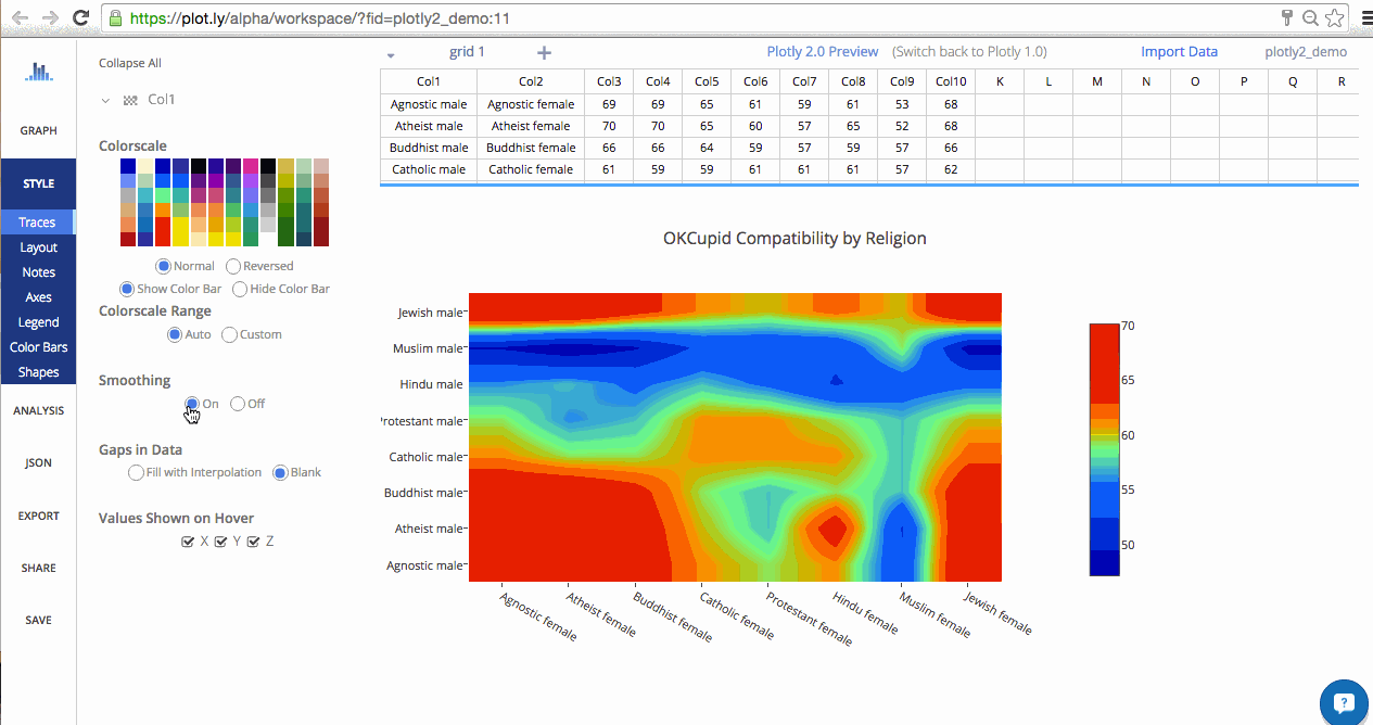
Chart Studio is all about interactive charts, so you can hover over the plot to see the values of that plot. Depending on what values you want to appear when you hover, can click on the 'X', 'Y', 'Z' or ‘Name' under 'Values Shown on Hover'.
Layout
The 'Layout' area is where you choose your colors, text position, or typeface. Certain colors and typeface are only available with a PRO subscription; click here to upgrade!
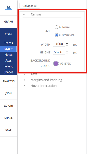
The 'Canvas' tab is the background of your plot. You can change the width and height of your plot, as well as the background color.
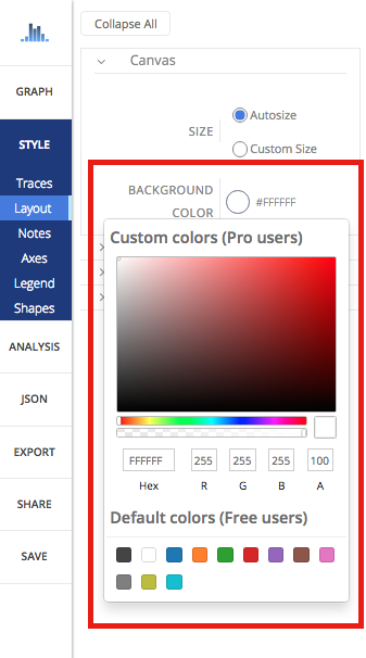
When you click on the background color field, this is what appears.
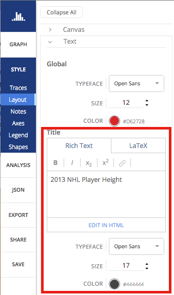
The 'Text' tab is where you add your plot title, and change the font, font color and font size of the title. The global text section controls all text of your plot (the title, the axes and legend labels). If you'd like a specific font for yout title, you change it in the fields below the text box.
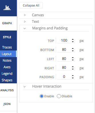
You can also change the margins and padding of your plot, as well as enable and disable your hover interaction.
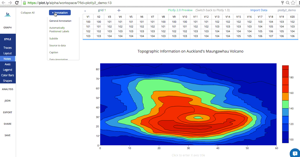
Notes
If you want to add annotations to your plot, the 'Notes' section is the place. Click the blue '+ Annotation' button at the top right-hand side to add general notes, subtitles, the source of your data, and to automatically mark your data points. For more information on how to add annotations to your plots, click here!
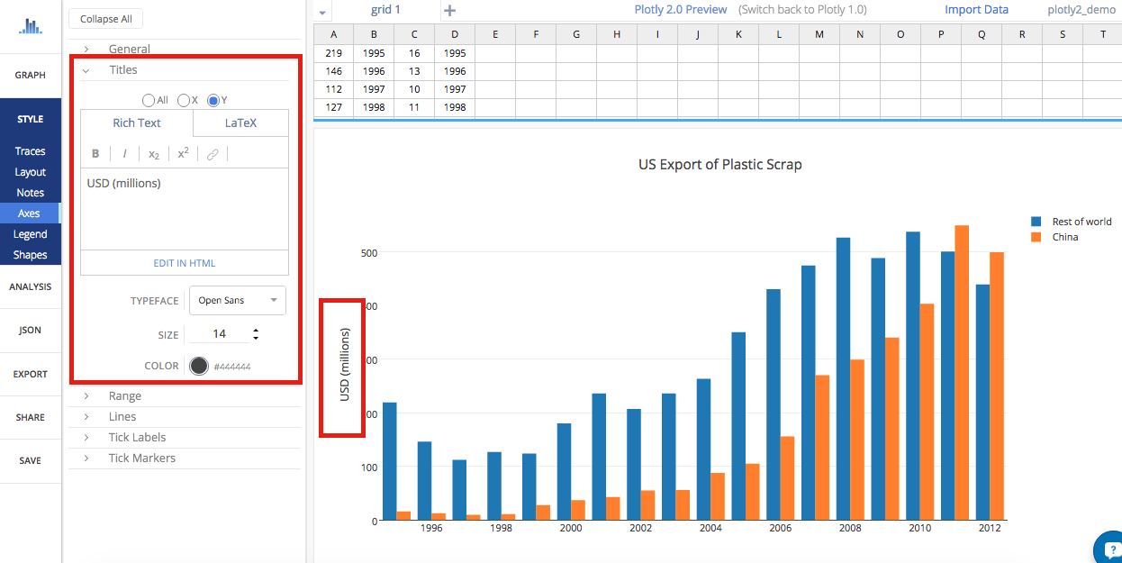
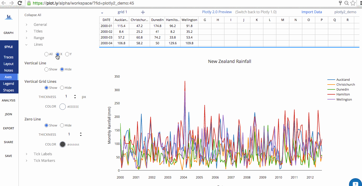
Axes
The 'Axes' section has sub-tabs that relate to the values and labels of your plot. The 'Titles' sub-tab is where you can label your axes by clicking on 'All', 'X', or 'Y', and just like the plot title, you're also able to change the font, font color and font size of the axes labels.
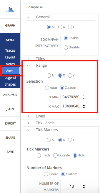
To change the range of your axes, you'll need to visit the 'Range' sub-tab. This includes reversing the axis by flipping the min/max values. You can also leave the range selection as auto, or click on 'Custom' and add the unix timestamps in the 'X-MIN' and 'X-MAX' fields under 'Selection'. The range and axis specifications are done in unix timestamps.
If you're dealing with time series data and need a little help in editing date axes, visit this page.
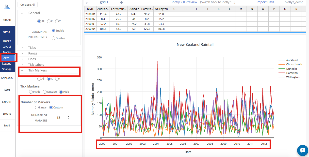
Another option is to select 'Custom' in the same section, and enter the number of markers you want to show on your plot. If your plot sets the dates as biannual, but you want to show every consecutive year, this is the other place to set that up.
Let's go back a few sub-tabs, to 'Lines'. This is where you can add grid lines and zero lines to your plot. You have the option of selecting 'All' for both your x and y axes, or select them individually. If you click on 'Show' under the first 'Line', you can position these lines at the top or bottom, or left or right of your plot. The 'Grid Lines' option displays a grid behind your graph. The zero line shows where '0' is on your plot, which could be helpful if you have both positive and negative values. You can choose the thickness and color for all these lines.
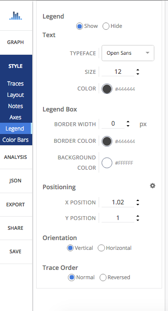
Legend
If you'd like to show your legend on your plot, click on 'Legend', and select 'Show'. The Text area is where you can change the font, font color and font size of the labels of your legend. You can also create a border around your legend, adjust the border width, play around with the color of its edges and its background. The positioning of the legend can be changed as well, along with the orientation. You also have two options for the trace order in your legend; showing your traces as is, or reversing the order.
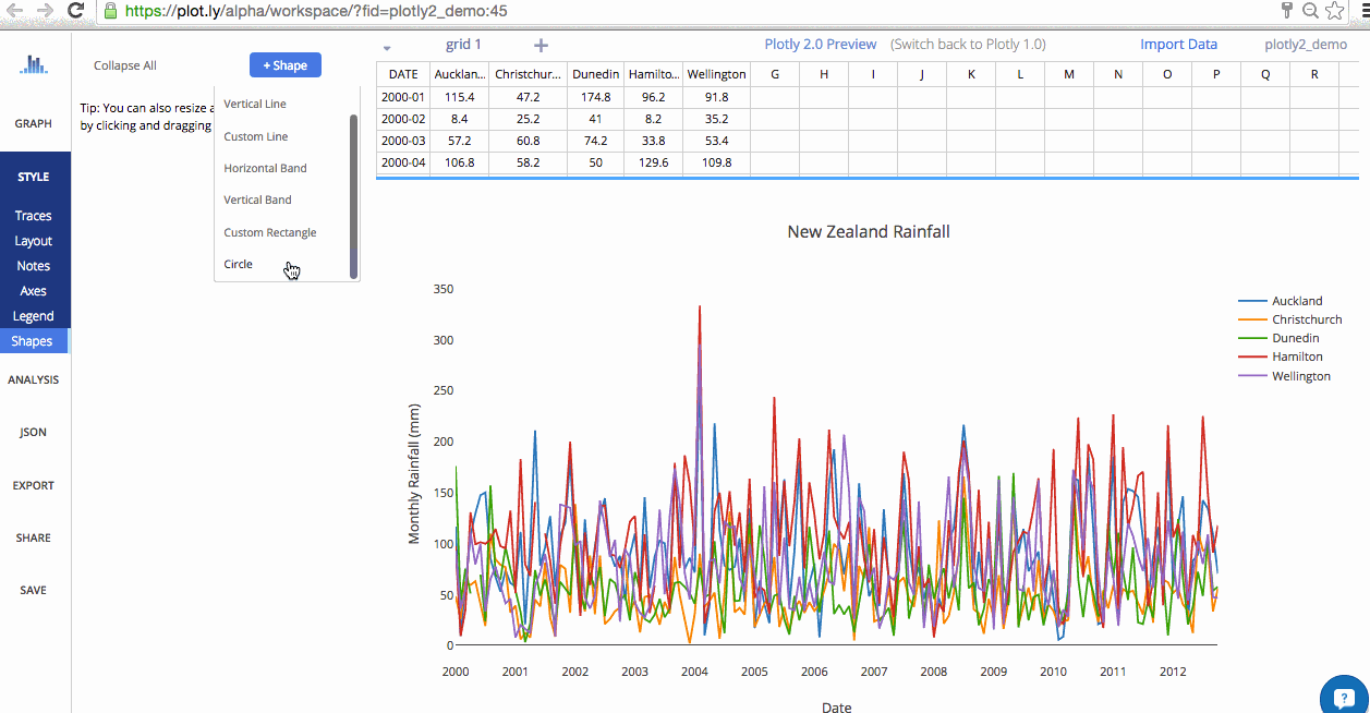
Shapes
The 'Shapes' section is where you can add shapes to your plot. Click the blue '+ Shape' button on the top right-hand side. You have a few options to choose from, including vertical and horizontal lines and bands, custom lines and rectangles, and circles. Below, we show you how to add a circle to your graph.
Images
Do you have an image or logo in mind and want to add it to your plot? The 'Images' section is where to go.
![]()
Once that panel opens, click on the blue '+ Image' button at the top right-hand side to upload or drag and drop your image.
![]()
You can play with the positioning and anchoring of your image so it appears exactly where you want it to be. For more information on how to do this, check out this tutorial!
Tips and Tricks
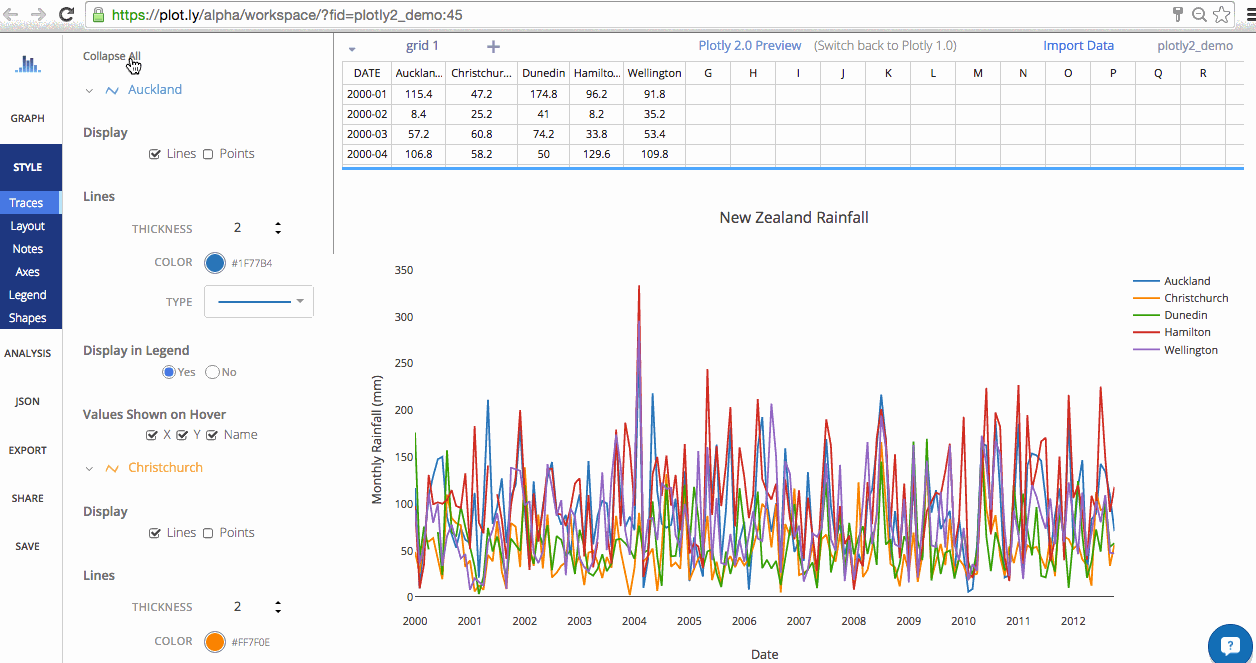
If your plot has multiple traces, some panels can get a little messy. The 'Collapse All' button found at the top left-hand side of these panels organize this part of your workspace. You can then open each trace or sub-tab to view them individually, or hit 'Expand All'.
Did you know that you can also use HTML syntax to your title and labels? To learn more about HTML and how to add tags and codes to your text, visit this page!