Make a Chart with a Subplot with Chart Studio and Excel
Chart with a Subplot with Chart Studio
Upload your Excel data to Chart Studio's grid
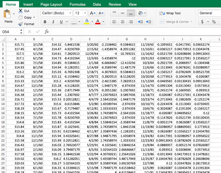
Open the data file for this tutorial in Excel. You can download the file here in CSV format
Head to Chart Studio
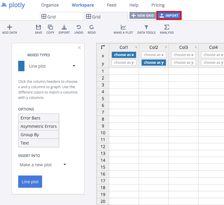
Head to the Chart Studio Workspace and sign into your free Chart Studio account. Go to 'Import,' click 'Upload a file,' then choose your Excel file to upload. Your Excel file will now open in Chart Studio's grid. For more about Chart Studio's grid, see this tutorial
Creating Your Chart
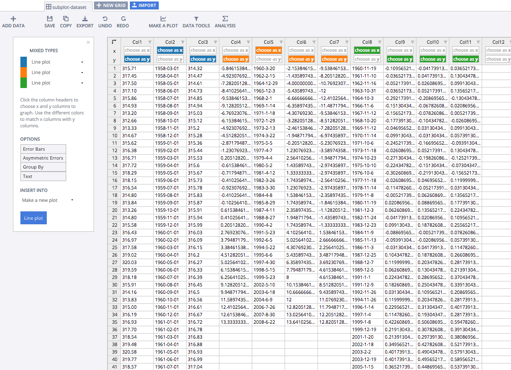
Label your columns like we did below. You'll have three different x-y datasets (Date, Atmospheric CO2 [Mauna Loa and South Pole], Date, Global Temperature Anomaly, and +2/-2 Standard Error, and Date, Heat Content and +2/-2 Standard Error). Select 'Line plots' from the MAKE A PLOT menu and then click line plot in the bottom left.
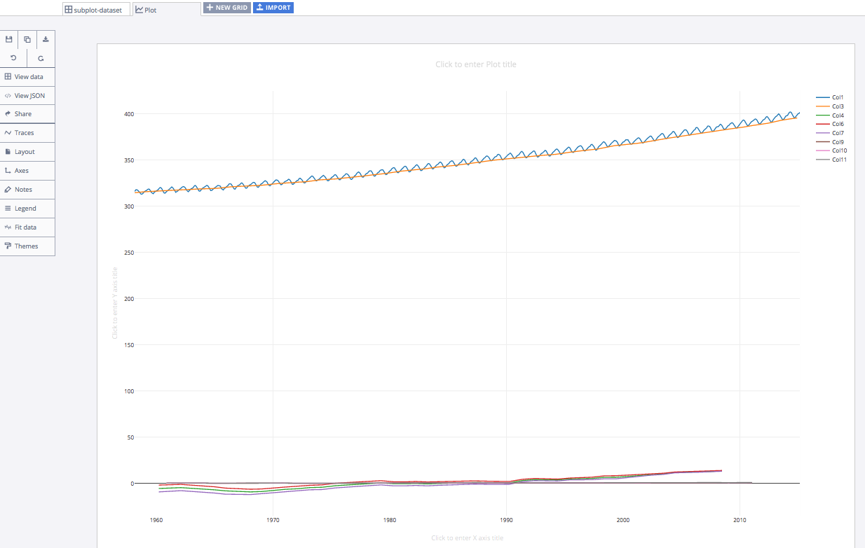
Your plot would initially look something like this.
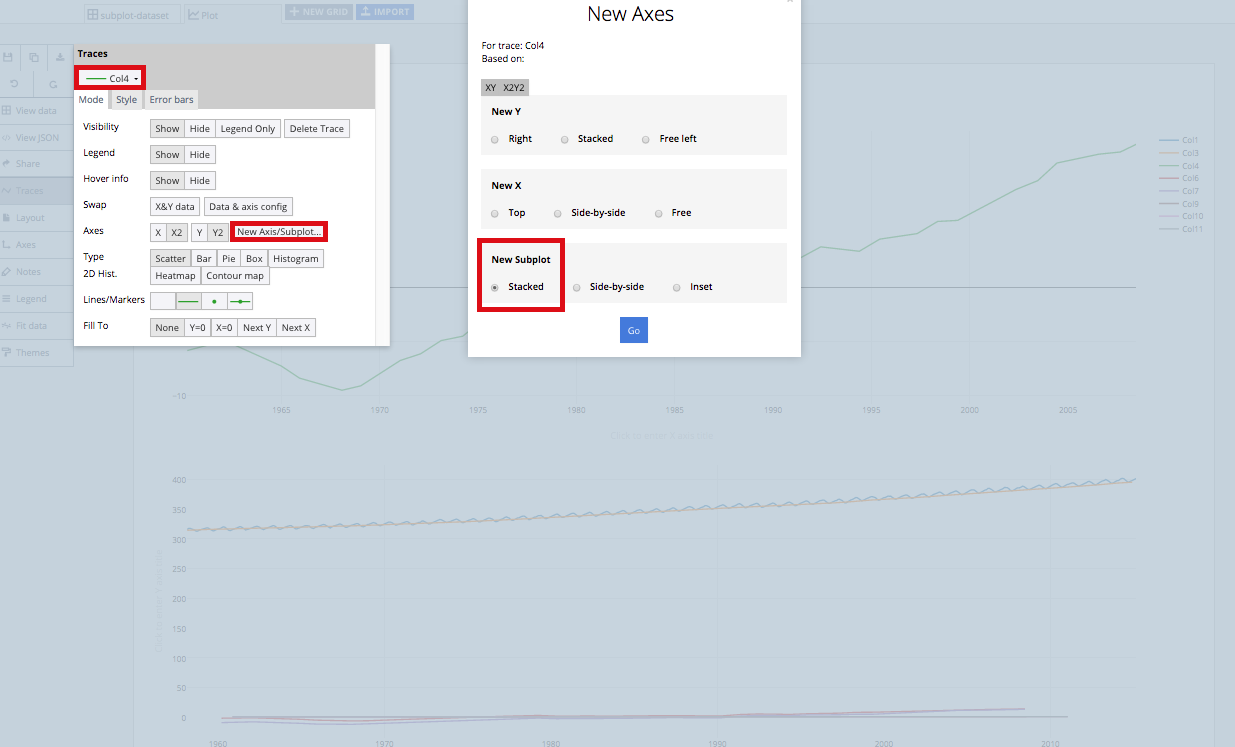
Head to the TRACES popover and access Col4 from the dropdown menu. From 'Axes' you'll want to click New Axis/Subplot bar. From New Axis/Subplot you'll want to click 'Stacked' under New Subplot.
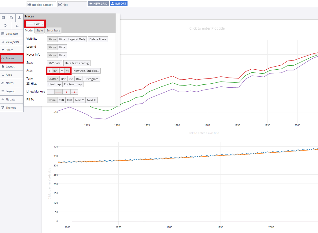
Now, head back to the TRACES popover. Shift Col6 and Col7 to the new subplot. To do this, change the axes to X2 and Y2 in both cases.
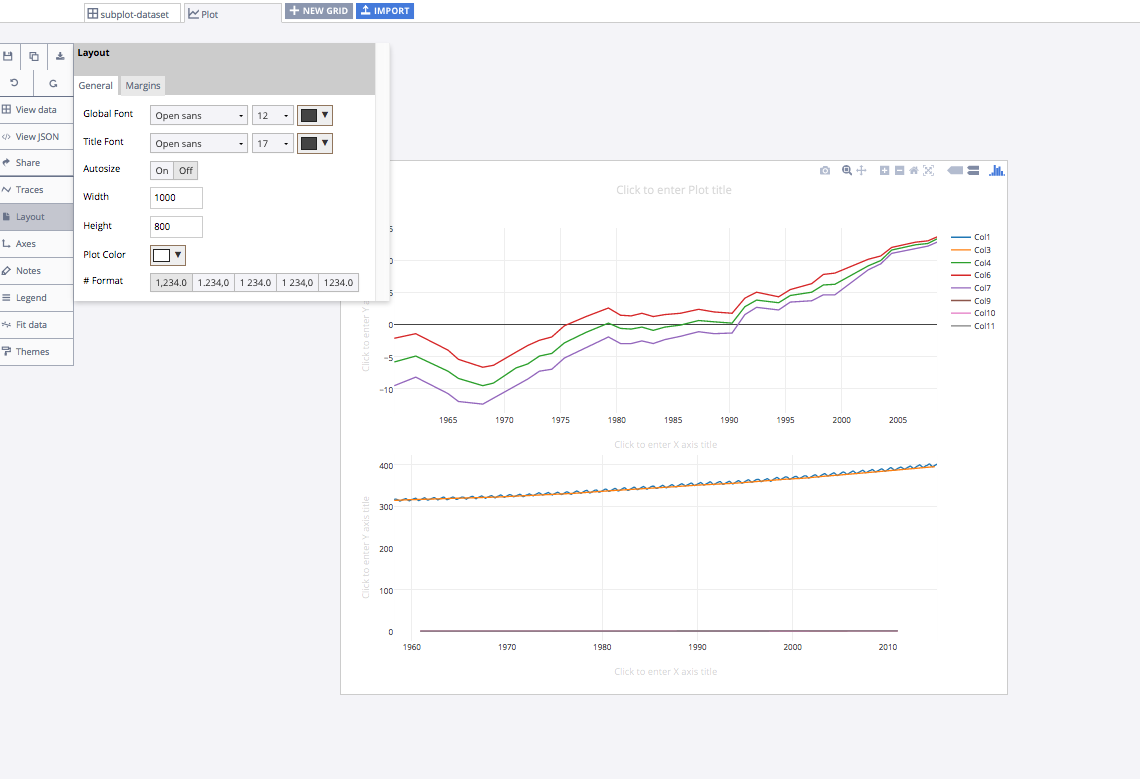
Take a moment to resize your plot to something less wide. A width of 1000 and a height of 800 seems reasonable. Head to the layout menu to do this.
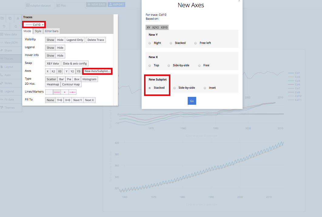
Now, head to the TRACES popover again and access Col10 from the dropdown menu. Move this trace, along with the Col9 and Col11 traces to the 'X2' and 'Y2' axes. Then head to the 'New Axis/Subplot' popover and create a 'New subplot' for trace Col10, similar to what you previously for Col4.
Then, move Col9 and Col11 to the same axes (X3 and Y3). Your plot would then look something like this.
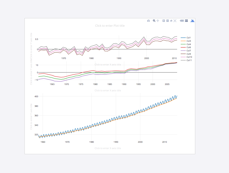
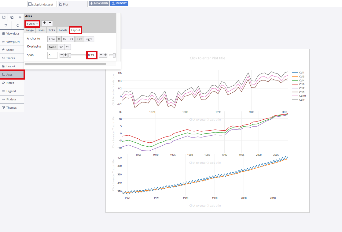
You can play with the axes ranges within the AXES popover. You can also adjust the span of each subplot within the AXES opover and Layout menu. We found that a 'Span' of 0 to 0.33 worked best for the Y Axis, 0.34 to 0.67 for the Y Axis 2, and 0.68 to 1.00 for the Y Axis. Your plot would then look something like this.
Finalizing Your Graph
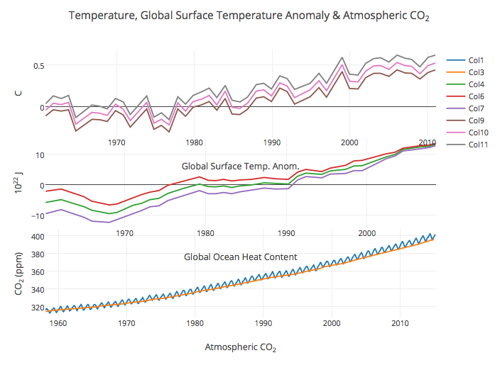
Adding titles to your graph and to all of the x and y axes of your subplots is important. After titling your plot, it should look something like this.
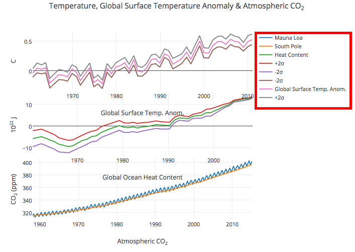
Now, add some description to the different traces in your legend. Follow our lead.
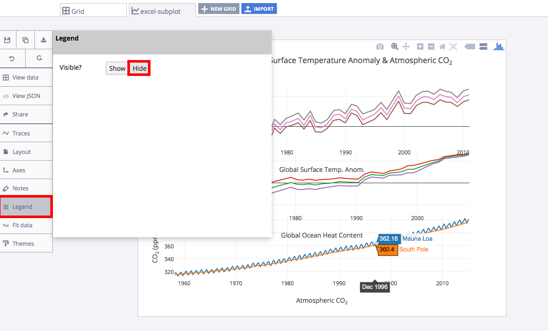
Once you've added the text to your legend, you can head to the LEGEND popover and hide it. This will make your graph less cluttered. Your readers will see the trace descriptors on the hover!
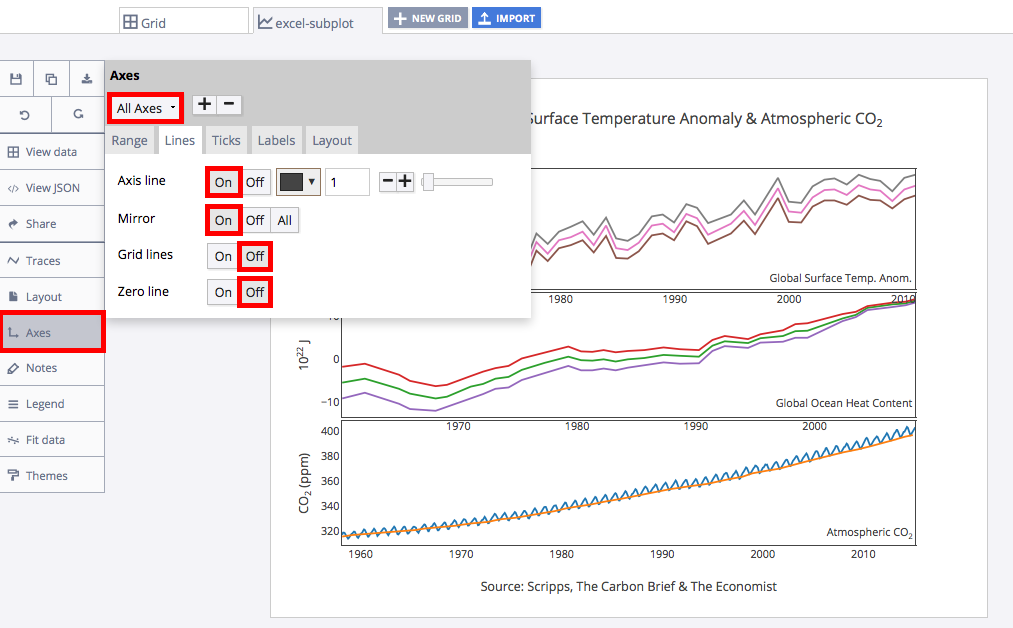
Now for a little styling. Head to the AXES popover and ensure that 'All Axes' is selected. Next, access the 'Lines' menu and turn the 'Axis line' and 'Mirror' on while the 'Grid lines' and 'Zero line' off.
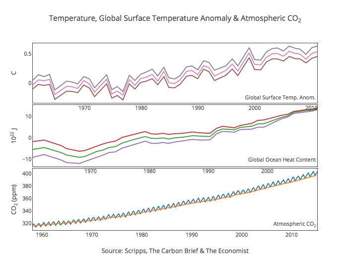
Your plot should now look something like this. In order to get the graph at the top of the tutorial, you’ll need to style it a little more.
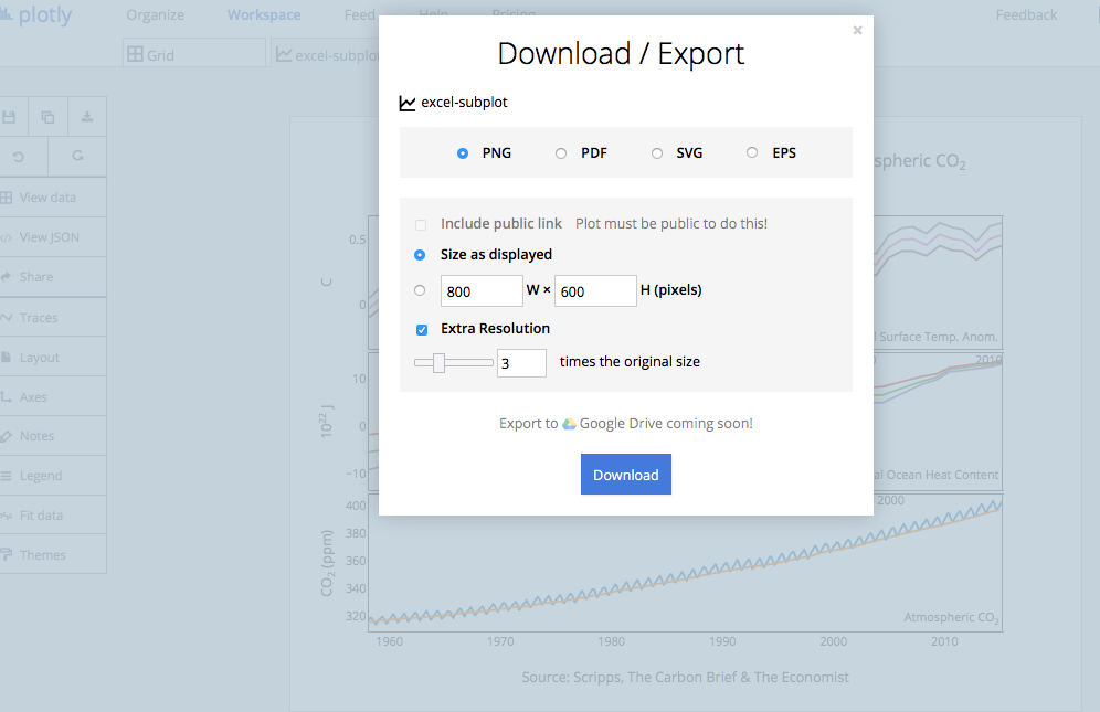
We used a note to link to our source data. You can download your finished Chart Studio graph to embed in your Excel workbook. We also recommend including the Chart Studio link to the graph inside your Excel workbook for easy access to the interactive Chart Studio version. Get the link to your graph by clicking the 'Share' button. Download an image of your Chart Studio graph by clicking EXPORT on the toolbar.
To add the Excel file to your workbook, click where you want to insert the picture inside Excel. On the INSERT tab inside Excel, in the ILLUSTRATIONS group, click PICTURE. Locate the Chart Studio graph image that you downloaded and then double-click it. Notice that we also copy-pasted the Chart Studio graph link in a cell for easy access to the interactive Chart Studio version.

