Choropleth Maps
A map that uses differences in coloring within predefined areas to indicate the average values of a variable within those areas.
Try an Example
A choropleth map provides an easy way to visualize how a measurement varies across a geographic area or it shows the level of variability within a region.
Before getting started with your own dataset, you can check out an example. First, select the 'Type' menu. Hovering the mouse over the chart type icon will display three options: 1) Charts like this by Plotly users 2) View tutorials on this chart type 3) See a basic example.
Clicking the 'See a basic example' option will show what a sample chart looks like after adding data and editing with the style. You'll also see what labels and style attributes were selected for this specific chart, as well as the end result.
You can also use the data featured in this tutorial by clicking on 'Open This Data in Chart Studio' on the left-hand side. It'll open in Chart Studio.
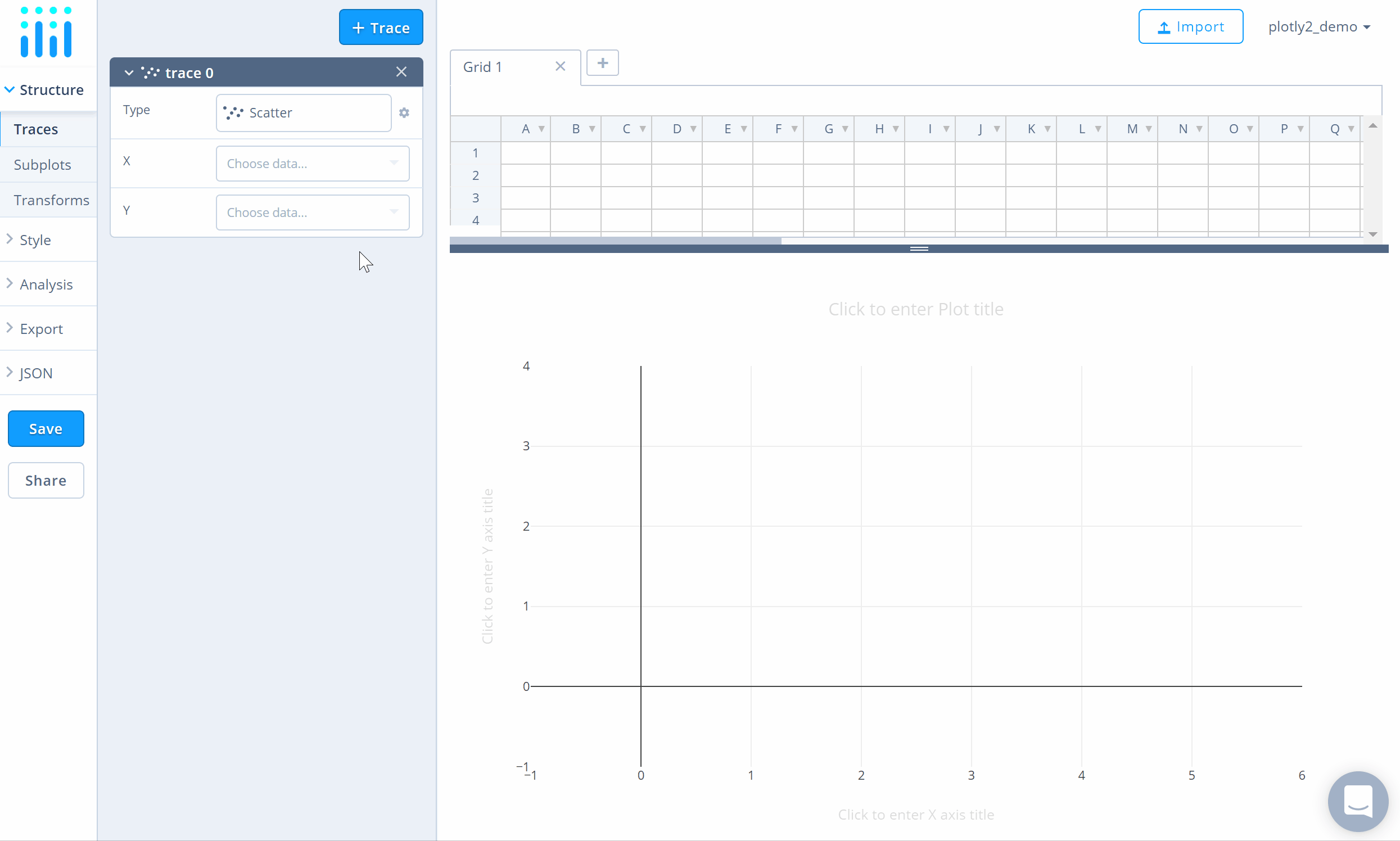
Add Data
Head to Chart Studio and add your data. You have the option of typing directly in the grid, uploading your file, or entering a URL of an online dataset. Chart Studio accepts .xls, .xlsx, or .csv files. For more information on how to enter your data, see this tutorial.
Create Chart
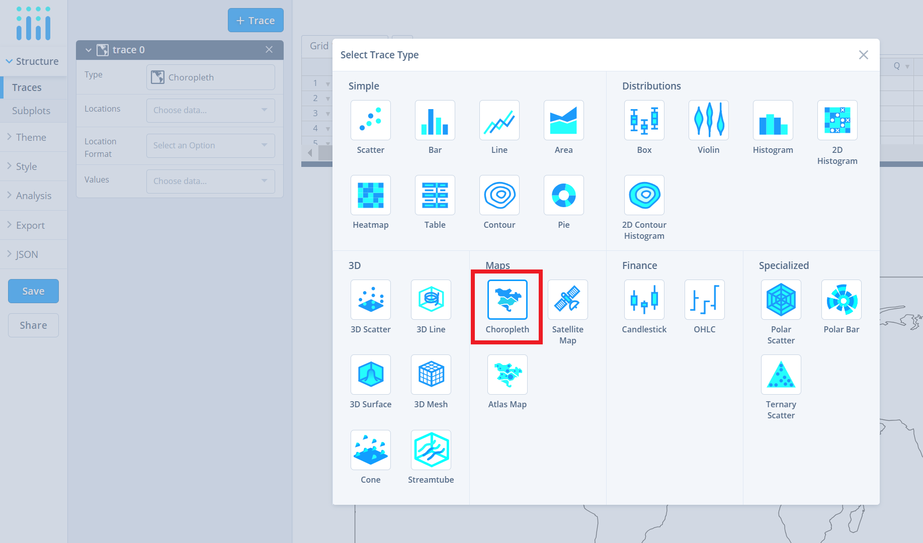
After adding data, go to the 'Traces' section under the 'Structure' menu on the left-hand side. Choose the 'Type' of trace, then choose 'Choropleth' under 'Maps' chart type.
Now, specify the coordinates in terms of location IDs (i.e., abbrevations). Note that the coordinates correspond to the centroid of each given location.
The attribute 'Location Format' determines the set of locations used to match entries in 'Location' to regions of the map. Then, specify the color values from the dropdown menu next to the attribute 'Values'.
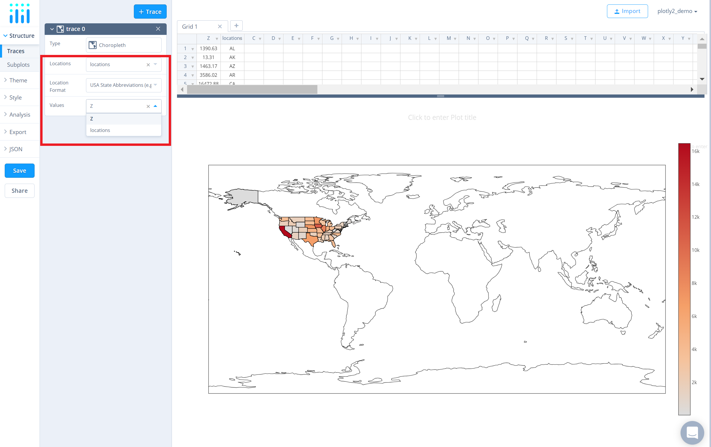
The data used in this example contains data points only for the USA, hence the points are populated around the USA region. Note that, at the moment, the Chart Studio supports only country location IDs for the World map and is limited to the USA region for state location IDs.
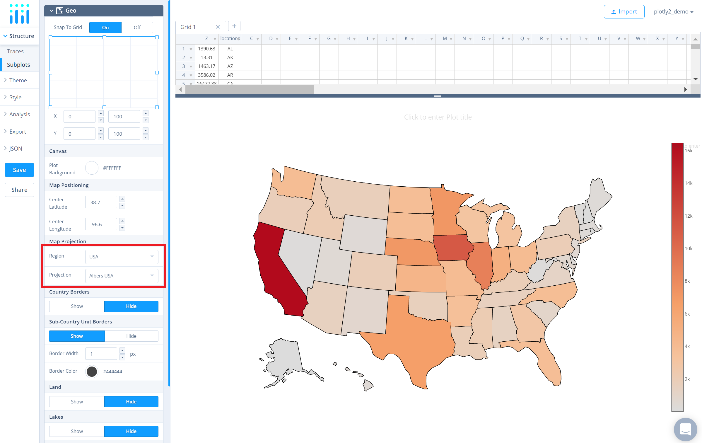
To change the view to just the USA, go to the 'Subplots' section under the 'Structure' menu and select 'USA' from the dropdown next to the attribute 'Region' under the property 'Map Projection'. This simply changes the region to the USA as opposed to a global map. Below, the 'Projection' dropdown will automatically default to 'Albers USA' then.
Style Chart
The 'Style' menu displays many options to modify characteristics of the overall chart layout or the individual traces. To see more options about styling the chart visit the style and layout section of the Chart Studio documentation.
Use the 'General' section under the 'Style' menu to set the plot title, and other layout properties.
To set the plot title, type the title text within the textbox provided under the 'Title' property.
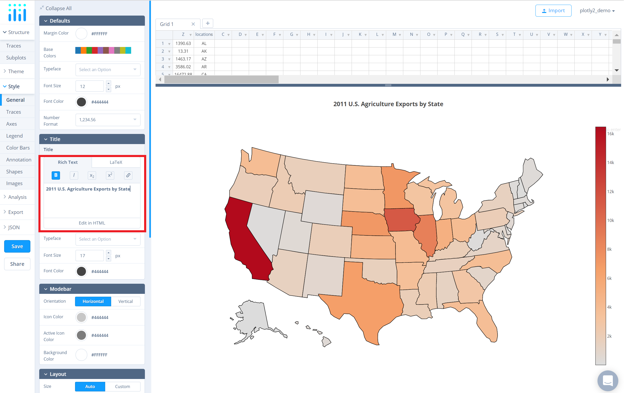
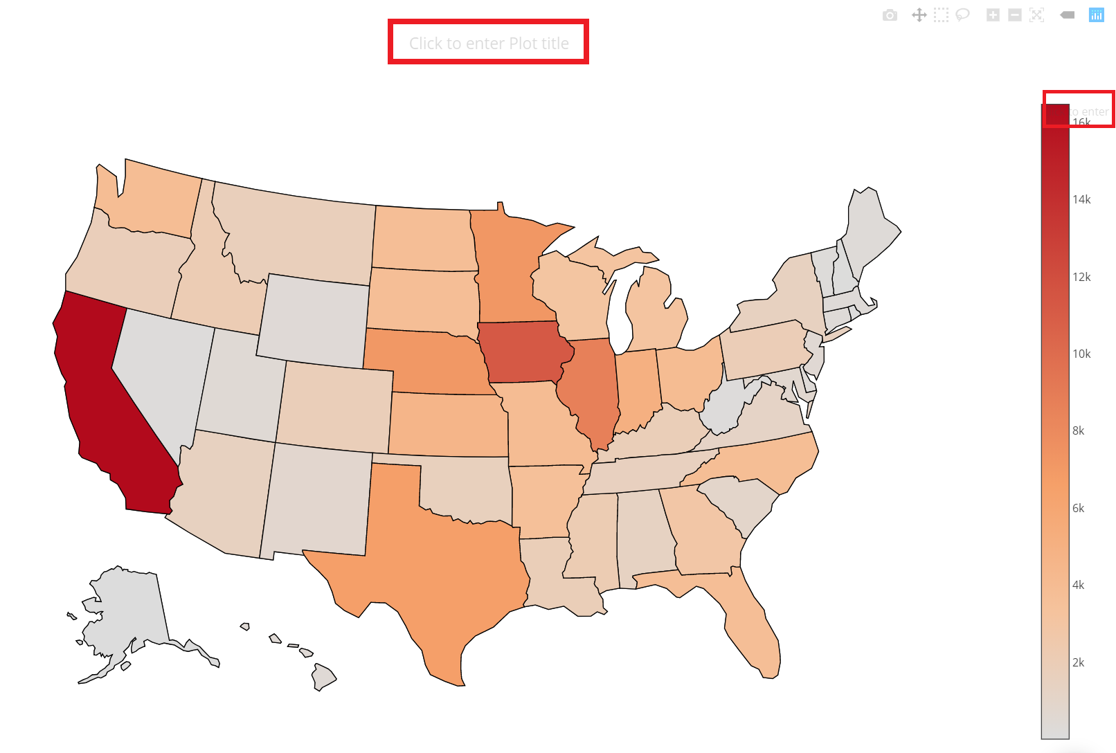
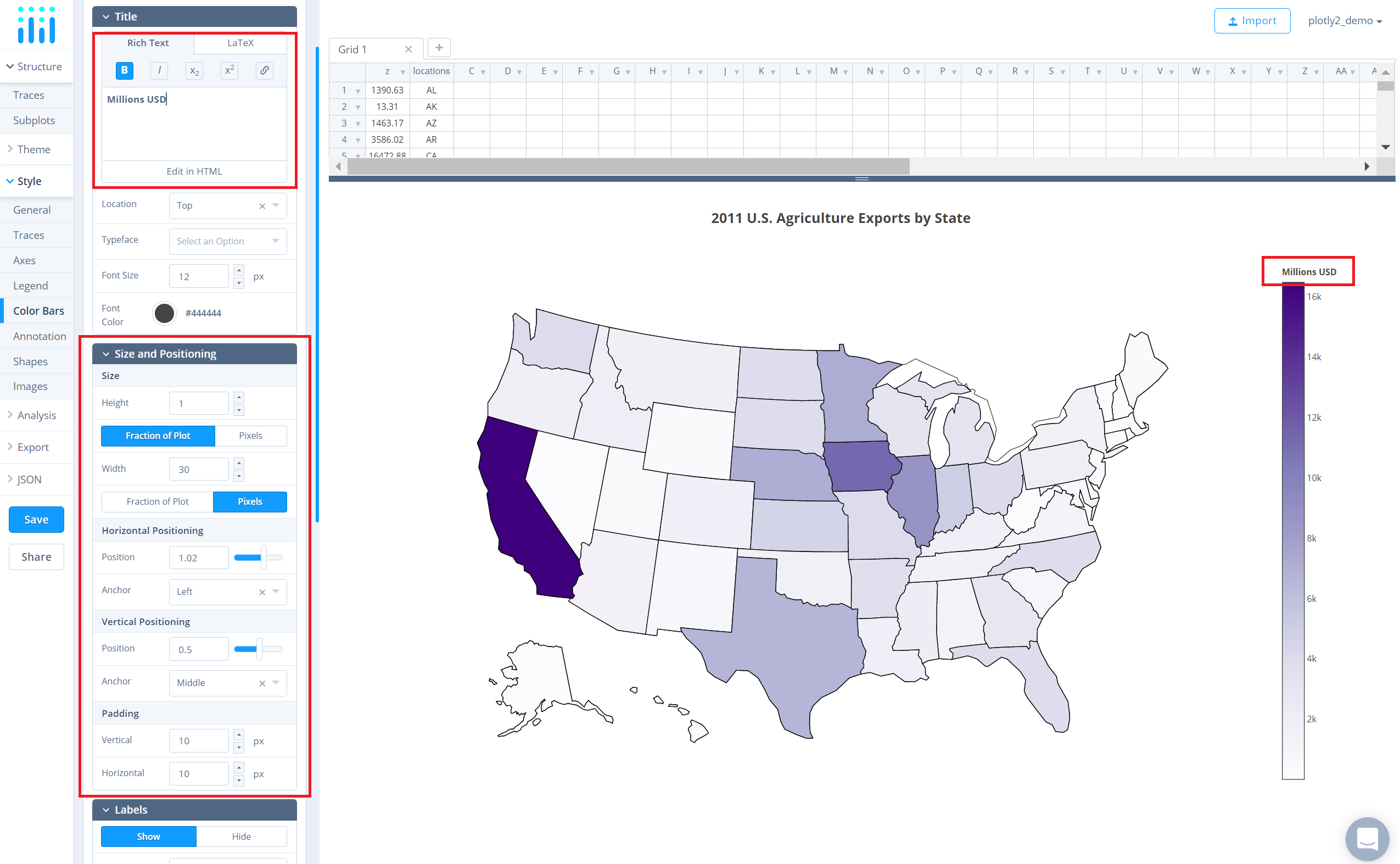
Another approach is to click and then enter the title directly on the plot interface. The same can be done for the color bar title.
Use the 'Traces' section under the 'Style' menu to change the properties of the trace.
To change the colorscale of the traces, click on the current colorscale next to the attribute 'Colorscale' in the same section. This will display a dropdown menu with the available colorscale types and their corresponding preset colorscales. Choose the desired colorscale.
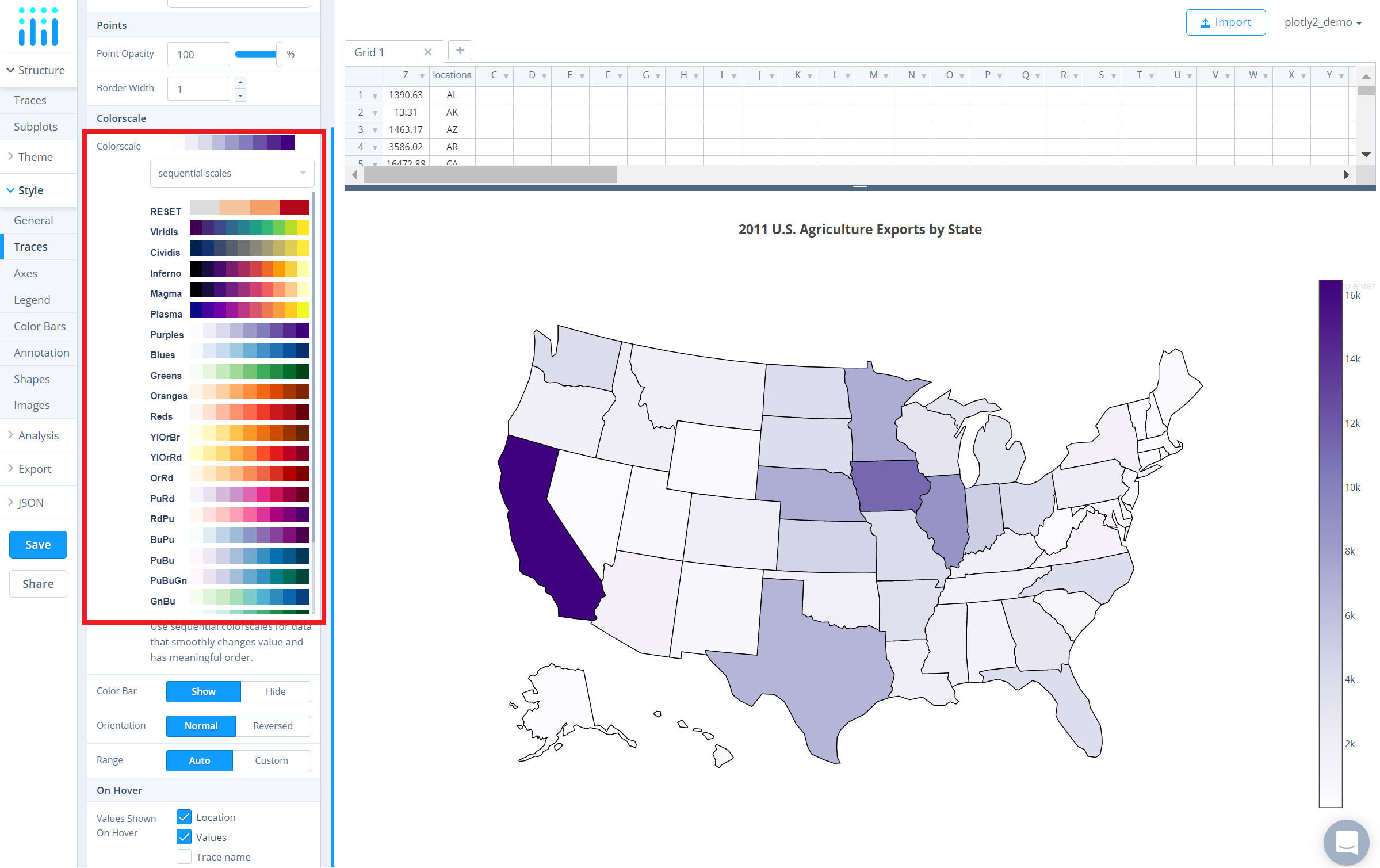
To reverse the chosen colorscale, set the 'Orientation' attribute to 'Reversed', as seen below.
Additionally, to show/hide the color bar, set the desired option next to the attribute 'Color Bar'. Use the 'Color Bar' section under the 'Style' menu to change the size and positioning of the color bar or to set the color bar title.
Save and Share
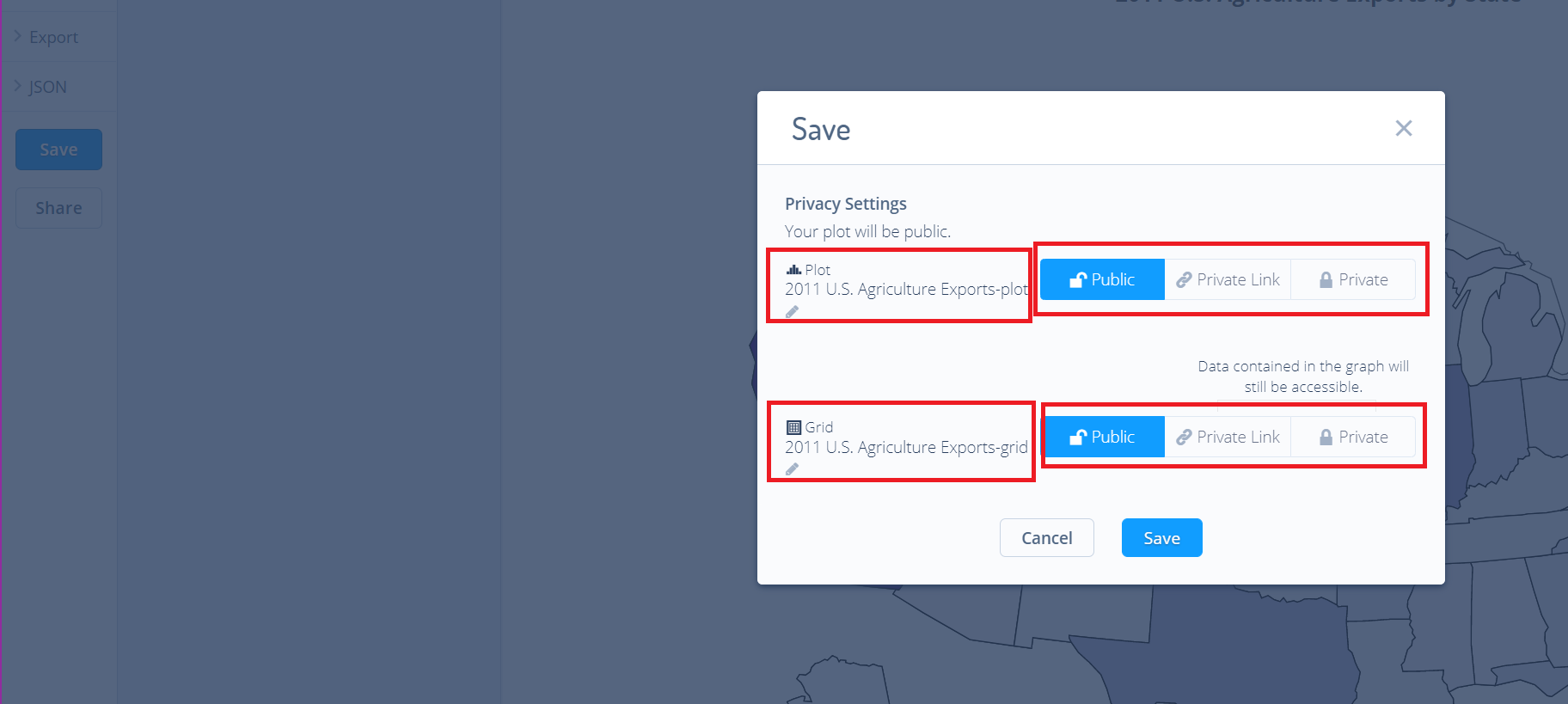
To save the plot, click the 'Save' button on the left-hand side. A save modal will appear, as seen below, where you can specify the filenames and privacy settings for your plot and data grid.
For more information on privacy settings and how sharing works, visit Chart Studio's sharing tutorial.