3D Mesh Plot
How to create a 3D mesh plot.
Try an Example
Before getting started with your own dataset, you can check out an example. First, select the 'Type' menu. Hovering the mouse over the chart type icon will display three options: 1) Charts like this by Chart Studio users 2) View tutorials on this chart type 3) See a basic example.
Clicking the 'See a basic example' option will show what a sample chart looks like after adding data and editing with the style. You'll also see what labels and style attributes were selected for this specific chart, as well as the end result.
You can also use the data featured in this tutorial by clicking on 'Open This Data in Chart Studio' on the left-hand side. It'll open in Chart Studio.
Add Data
Head to Chart Studio and add your data. You have the option of typing directly in the grid, uploading your file, or entering a URL of an online dataset. Chart Studio accepts .xls, .xlsx, or .csv files. For more information on how to enter your data, see this tutorial.
Create Chart
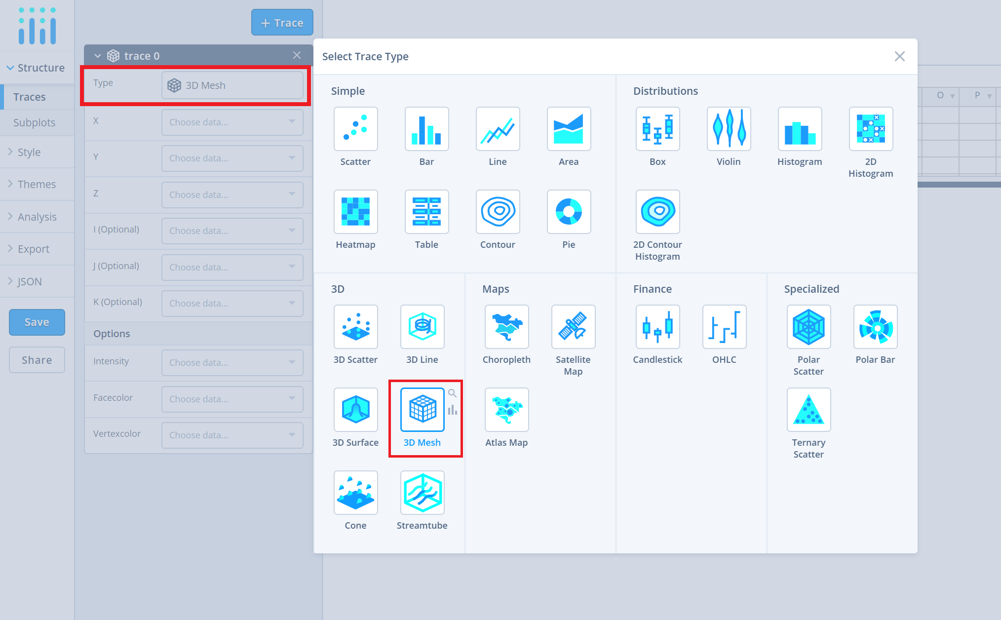
After adding the data, go to the 'Traces' section under the 'Structure' menu on the left-hand side. Choose the 'Type' of trace, then choose '3D Mesh' under '3D' chart type.
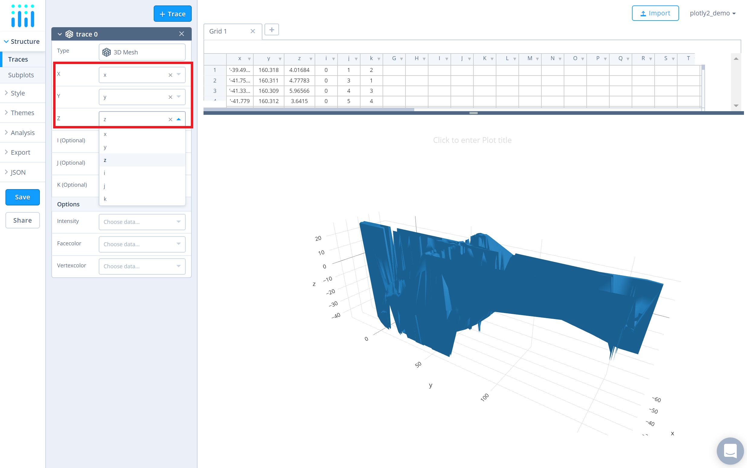
Next, fill out the necessary 'X', 'Y' and 'Z' values from their respective dropdown menus. This will create a raw 3D mesh, as seen below.
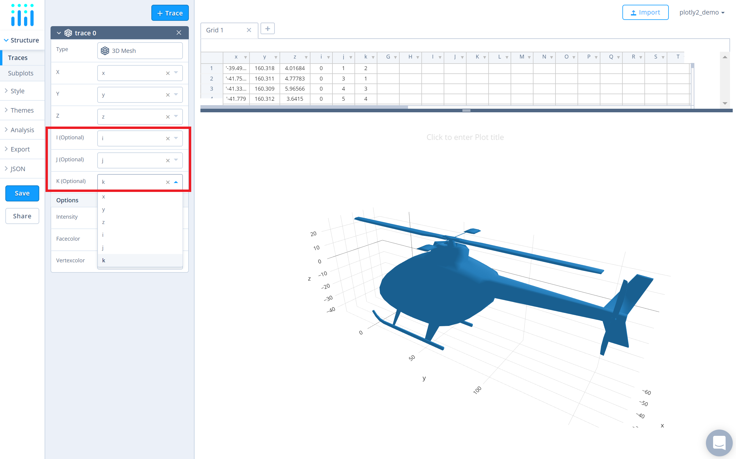
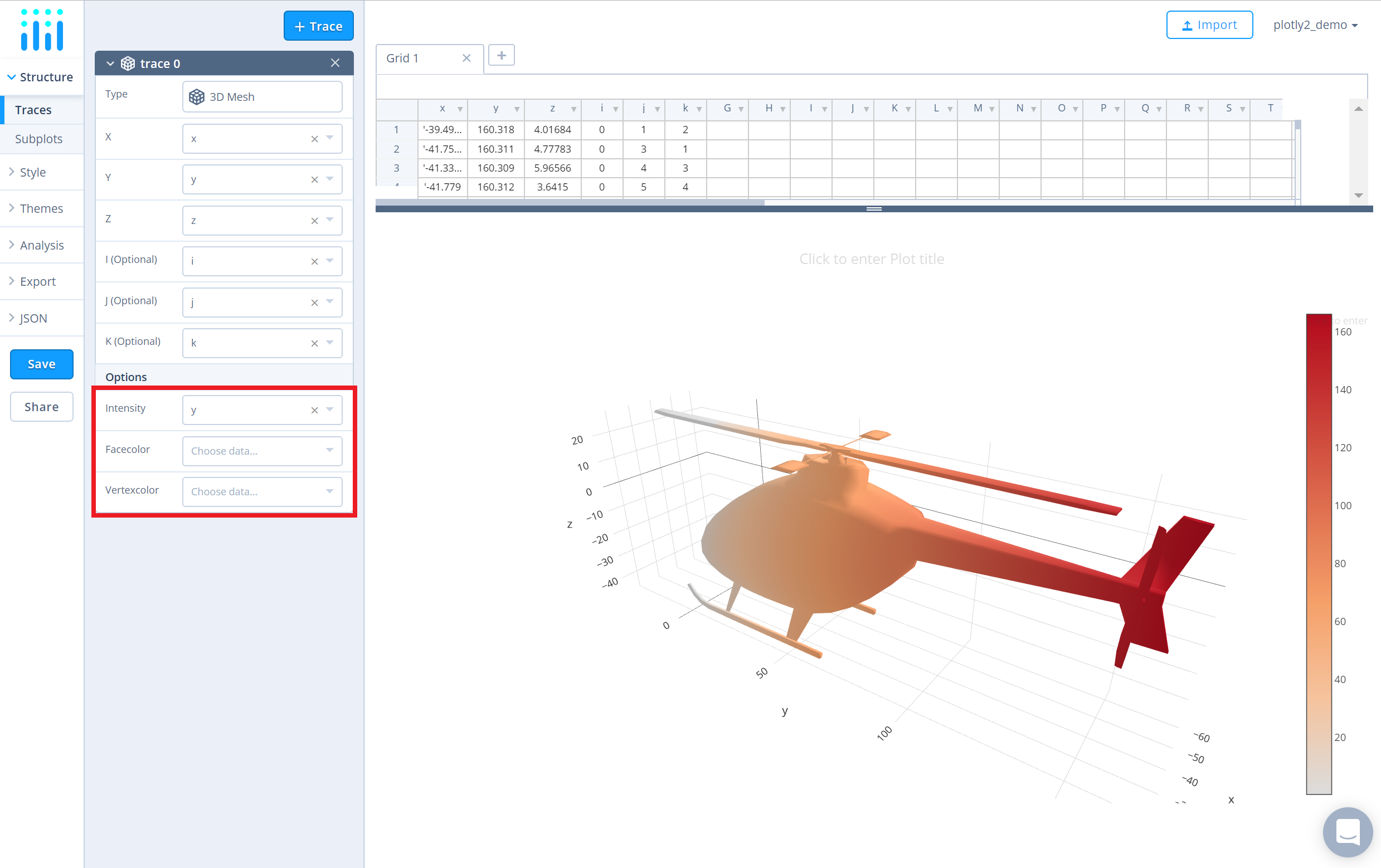
Additionally for 3D mesh plots, you have the option to add values for the attributes 'I', 'J' and 'K' that can be found immediately below within the trace panel.
Now, that the 3d mesh has it's structure completed, you can now add the coloring options via the following attributes: 'Intensity', 'Facecolor' or 'Vertexcolor'. The attribute 'Intensity' sets the vertex intensity values, 'Facecolor' sets the color of each face and 'Vertex' sets the color of each vertex. In this example, the coloring is set via the attribute 'Intensity' using 'Y' axis values.
Style Chart
The 'Style' menu displays many options to modify characteristics of the overall chart layout or the individual traces. To see more options about styling the chart, visit the style and layout section of the Chart Studio documentation.
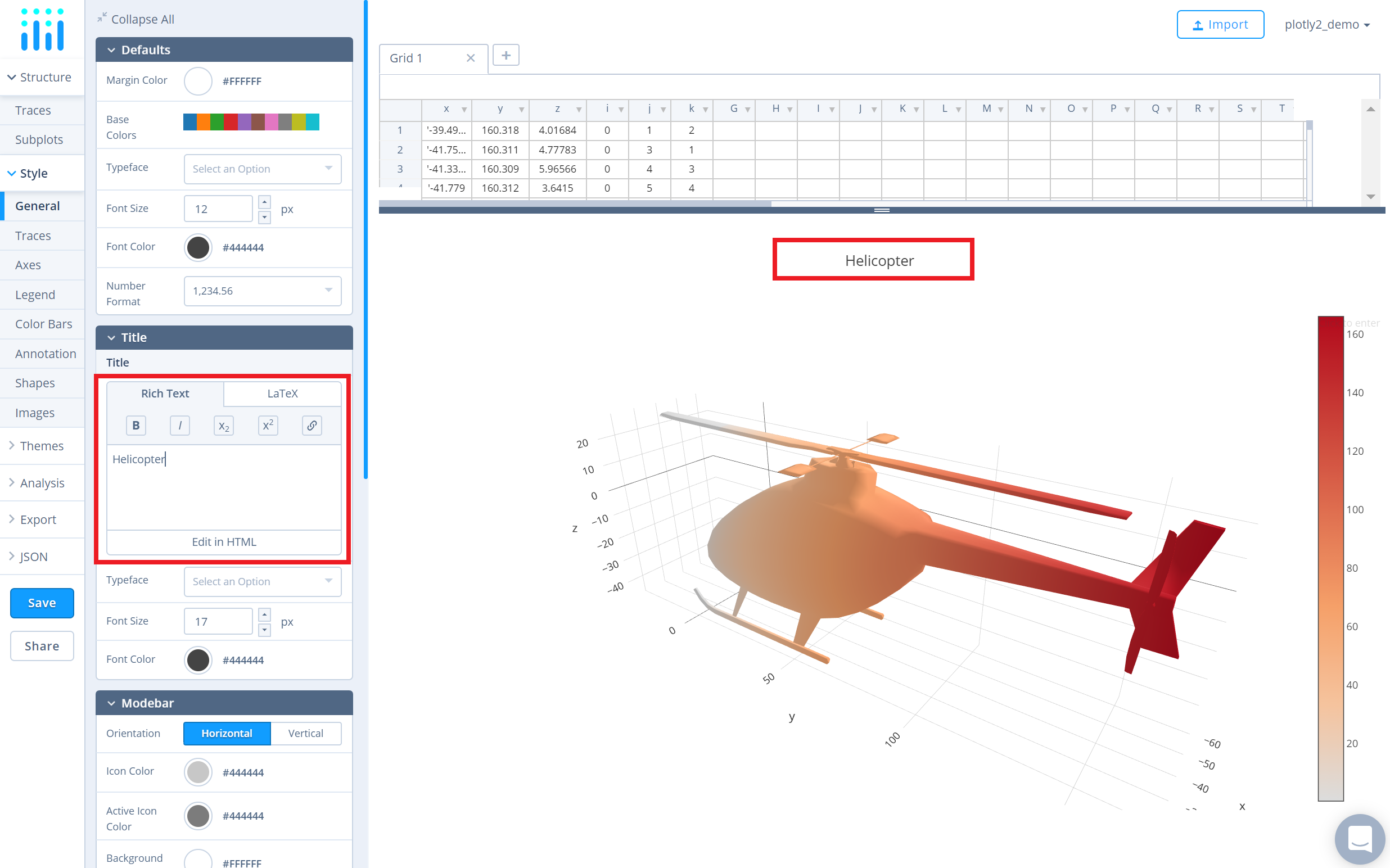
Use the 'General' section under the 'Style' menu to set the plot title, as well as change the layout background, margin color and font styles.
To set the plot title, type the title text within the textbox provided under the 'Title' property.
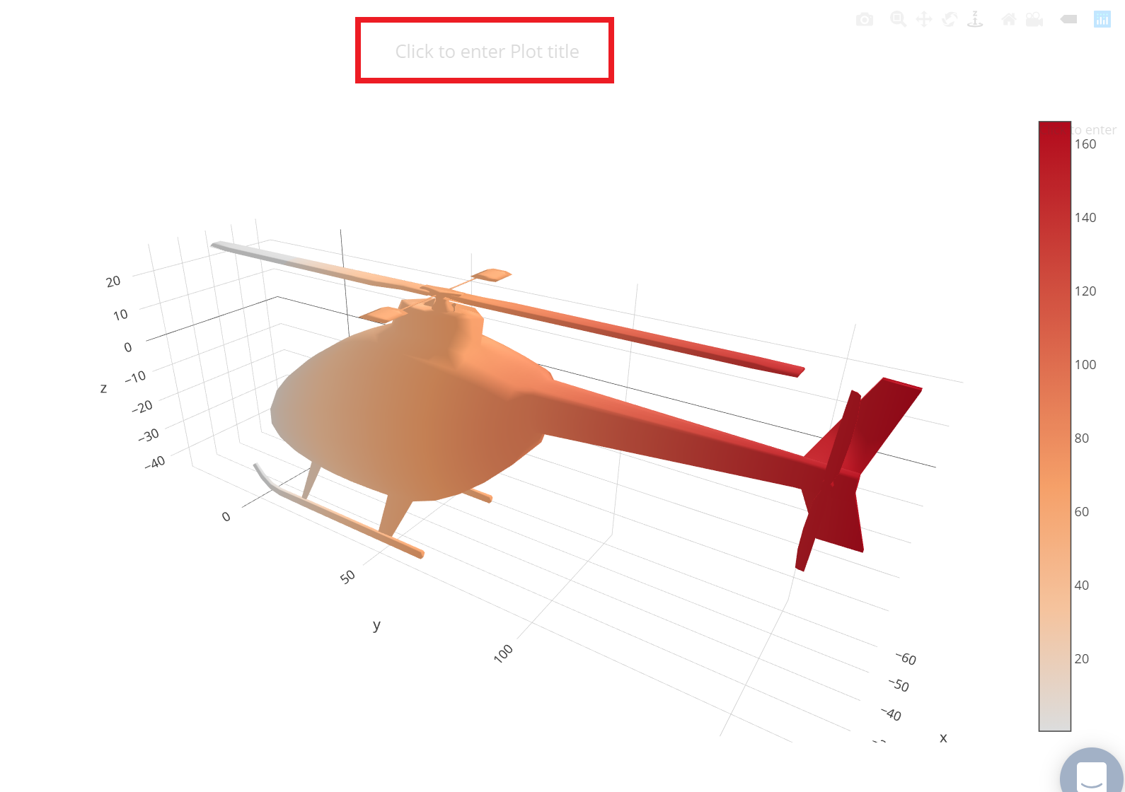
Another approach is to click and then enter the title directly on the plot interface.
Use the 'Traces' section under the 'Style' menu to change the properties of the 3D mesh such as the colorscale, lighting effects and its position, and hoverinfo.
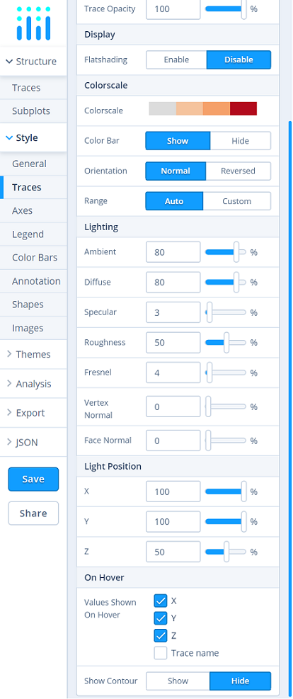
To change the colorscale of the traces, click on the current colorscale next to the attribute 'Colorscale' which will display the available colorscale types within the dropdown menu and the corresponding preset colorscales that are available under that type. Then choose the desired colorscale. To reverse the chosen colorscale, set the 'Orientation' attribute to 'Reversed', as seen below.
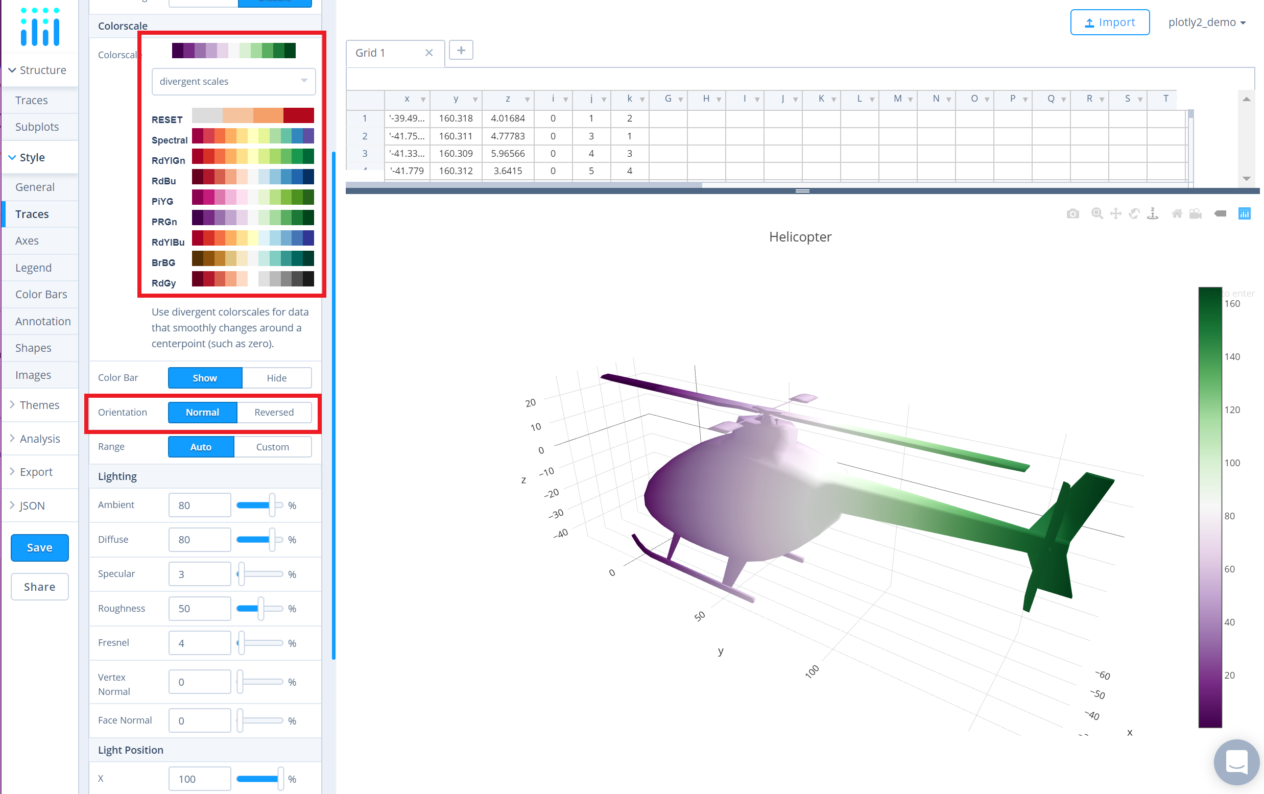
Additionally, to show/hide the color bar, set the desired option next to the attribute 'Color Bar'. Use the 'Color Bar' section under the 'Style' menu, to change the properties of the color bar.
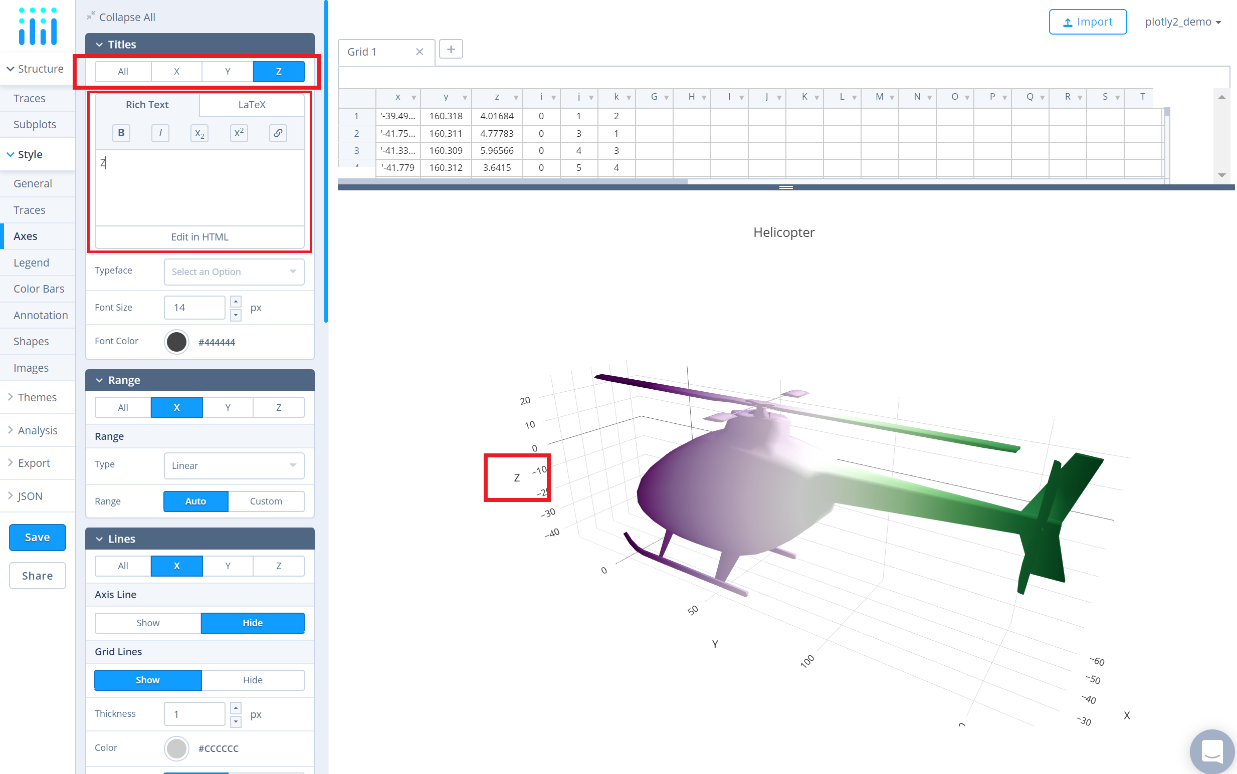
To change the axes tile, go to the 'Axes' section under the 'Style' menu and type the title text within the textbox provided under the 'Title' property for each axis.
Save and Share
To save the plot click the 'Save' button on the left-hand side. A save modal will appear, as seen below, where you can specify the filenames and privacy settings for your plot and data grid.
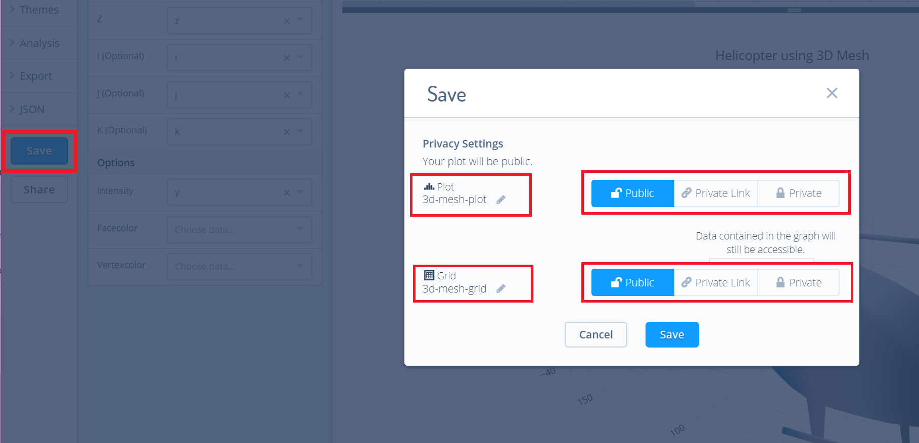
For more information on privacy settings and how sharing works, visit Chart Studio's sharing tutorial.