Make a Heatmap Online with Chart Studio and Excel
Heatmaps with Chart Studio
Upload your Excel Data to Chart Studio's Grid
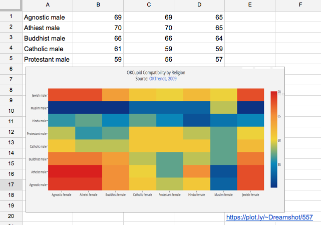
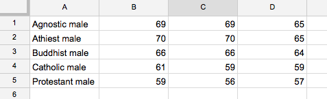
Open the data file for this tutorial in Excel. You can download the file here in CSV format
Head to Chart Studio
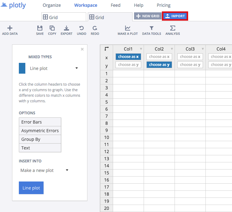
Head to the Chart Studio Workspace and sign into your free Chart Studio account. Go to 'Import', click 'Upload a file', then choose your Excel file to upload. Your Excel file will now open in Chart Studio's grid. For more about Chart Studio's grid, see this tutorial
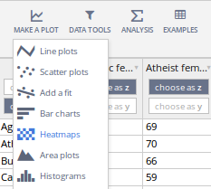
Select 'Heatmaps' from the MAKE A PLOT menu.
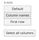
Select the 'Column names' button from the X-AXIS options in the sidebar and click 'Select all columns' button.
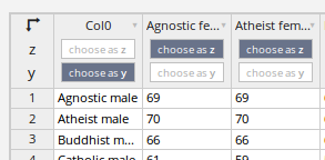
Deselect any columns you don't want to plot, and your row names column if you have one. This will be your 'y' value.
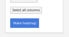
Click the blue plot button in the sidebar to create the chart.
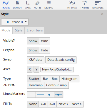
Traces
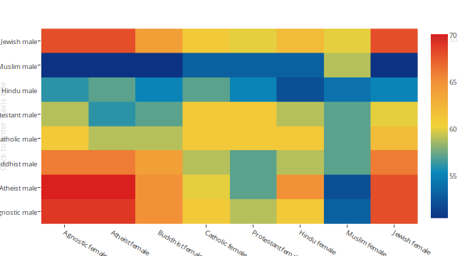
Your plot should look something like this.
The first step to styling it into the heatmap above is to open the TRACES popover in the toolbar.
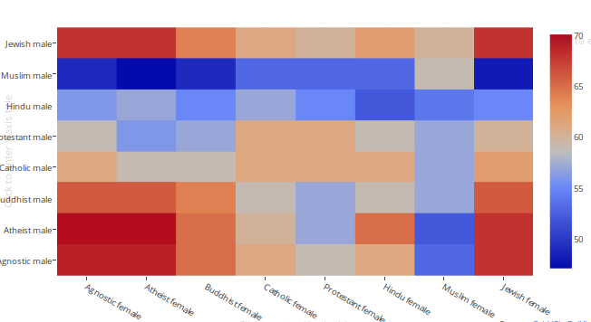
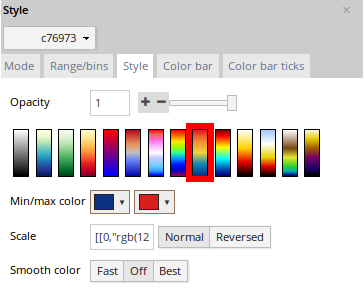
This is what the 'Style' tab of the TRACES popover should look like. We've selected one of the default gradients, red-yellow-blue.
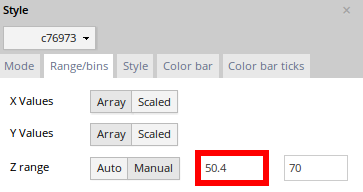
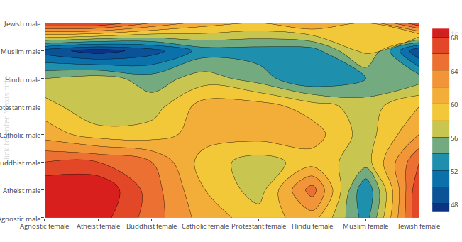
For this particular data, we also want to center our gradient so that yellow correlates to a value of 60.2, and everything above or below is a little red or green. The easiest way to do this is by nudging the 'Z range' values in the 'Range/bins' tab to converge on our desired midpoint – we compressed our range, but you can also stretch it if you prefer the effect.
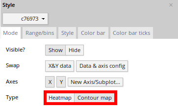
(Alternative: if you want to make a contour plot, just change the 'Type' setting in the 'Mode' tab.)
Contour Plot
Style and Annotate
Your plot should look something like this.
There's a little more styling you need to do to get the graph at the top of the chart.
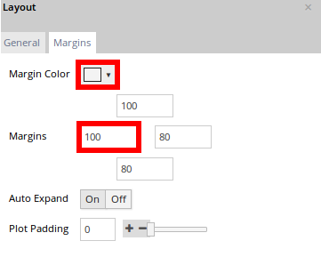
Here's how the LAYOUT popover should look.
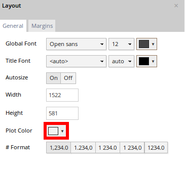
We've nudged the margins to accommodate the y-axis labels, and we're giving our chart a grey background.
We've titled our chart, and used markup to format our text and source our data.
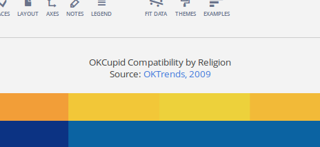
OKCupid Compatibility by Religion<br>Source: <a href=''http://blog.okcupid.com/index.php/how-races-and-religions-match-in-online-dating'' >OKTrends, 2009</a>
Export and Share
You can download your finished Chart Studio graph to embed in your Excel workbook. We also recommend including the Chart Studio link to the graph inside your Excel workbook for easy access to the interactive Chart Studio version. Get the link to your graph by clicking the 'Share' button. Download an image of your Chart Studio graph by clicking EXPORT on the toolbar.

Your finished chart should look something like this

To add the Excel file to your workbook, click where you want to insert the picture inside Excel. On the INSERT tab inside Excel, in the ILLUSTRATIONS group, click PICTURE. Locate the Chart Studio graph image that you downloaded and then double-click it. Notice that we also copy-pasted the Chart Studio graph link in a cell for easy access to the interactive Chart Studio version.