Animations in Chart Studio
Create Animations in Chart Studio
Try an Example
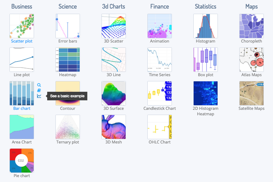
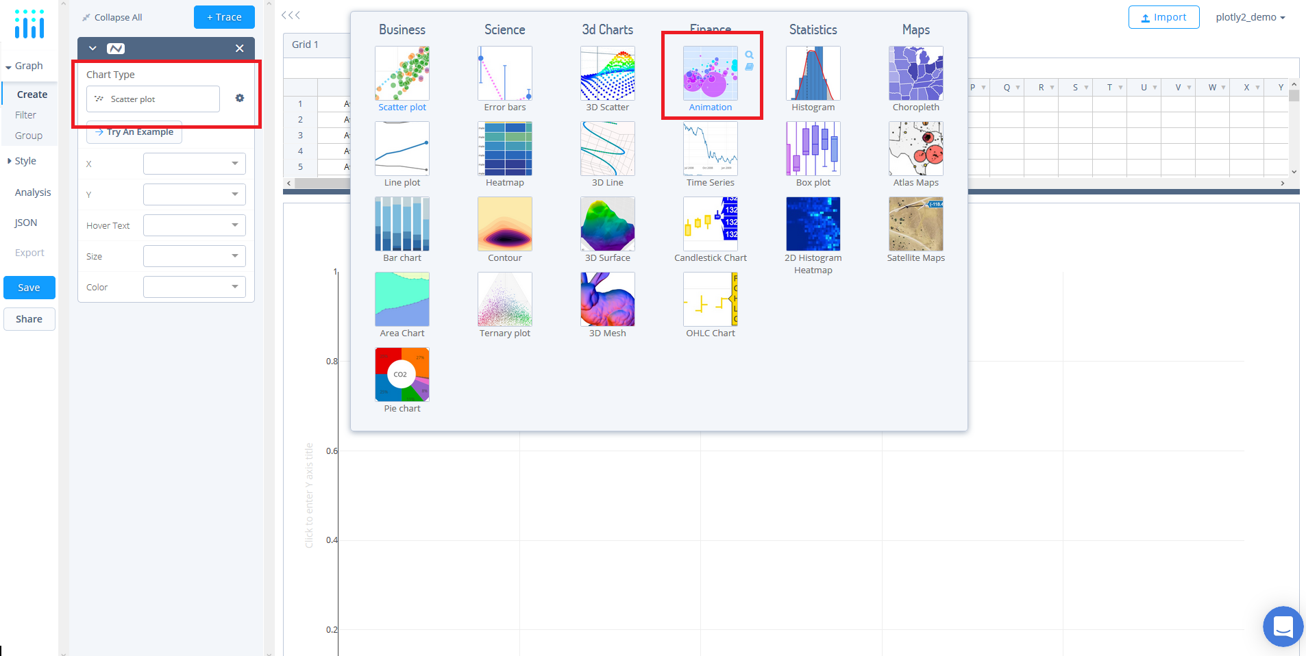
To try an example, select 'Chart Type' and a panel will appear with chart type options. Once you locate the animation icon under the 'FINANCE'column, you can check out an example before adding your own data by clicking the little graph icon that will show what a sample chart looks like after adding data and playing with the style. You'll also see what labels and style attributes were selected for this specific chart, as well as the end result.
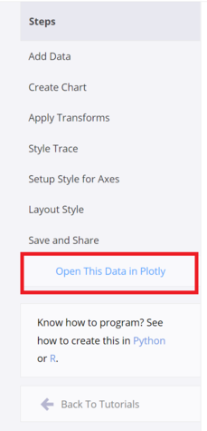
You can also use the data featured in this tutorial by clicking on 'Open This Data in Chart Studio' on the left-hand side. It'll open in your workspace.
Add Your Data to Chart Studio
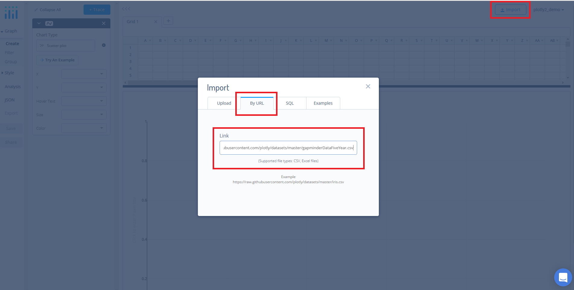
Head to Chart Studio’s new online workspace and add your data. You have the option of typing directly in the grid, uploading your file, or entering a URL of an online dataset. Chart Studio accepts .xls, .xlsx, or .csv files. For more information on how to enter your data, see this tutorial.
For this tutorial, we'll use the gapminder dataset which can be found here. Simply, copy the URL from GitHub. Now, returning to the workspace select 'IMPORT' and then 'By URL'. Here, you just paste the URL from GitHub.
Create Your Chart
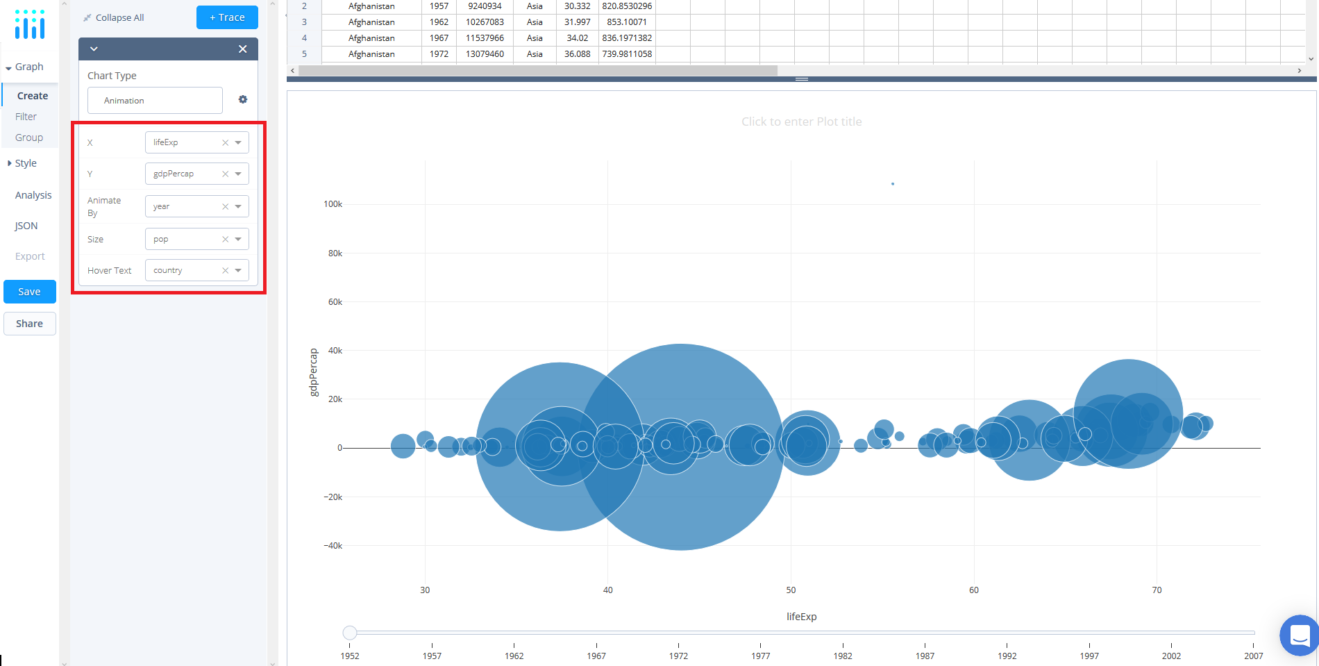
Now that we have the data added to the grid, we can select our chart type. Select GRAPH on the left-hand side, then 'Create'. Click 'Chart Type', then choose 'Animation' in the 'FINANCE' column.
Use the X and Y dropdowns to define X and Y variables for the chart. For this example, select the ‘gdpPerCap’ to display life expectancy data on the x axis and select ‘lifeExp’ to display population data on the Y axis. Next, select a column to animate by. For this example, selecting ‘year’ from the ‘Animate By’ dropdown will create and animation that displays how the relationship between life expectancy and GDP Per Captia has varied over time. To further the visualization, you can size points relative to data and display additional information on hover. For this example, select ‘population’ to size points based off of the population of each country. In addition, select ‘country’ in the ‘Hover Text’ dropdown to display the name of the country for each point on hover.
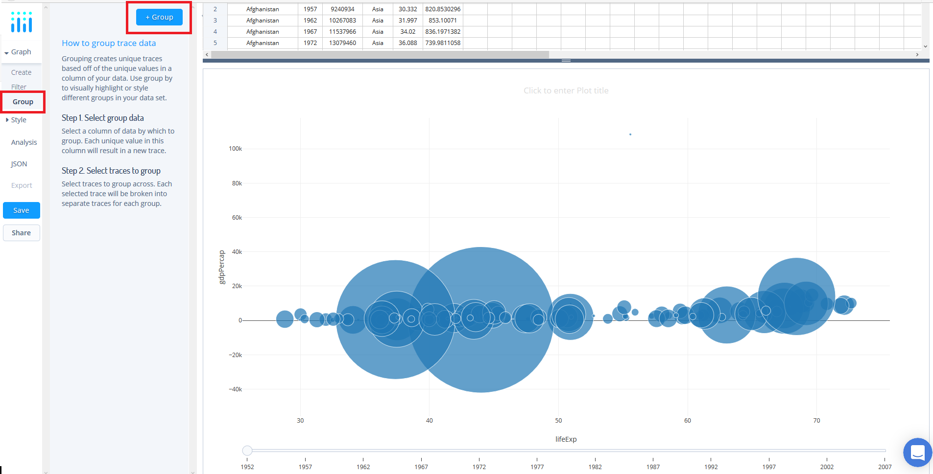
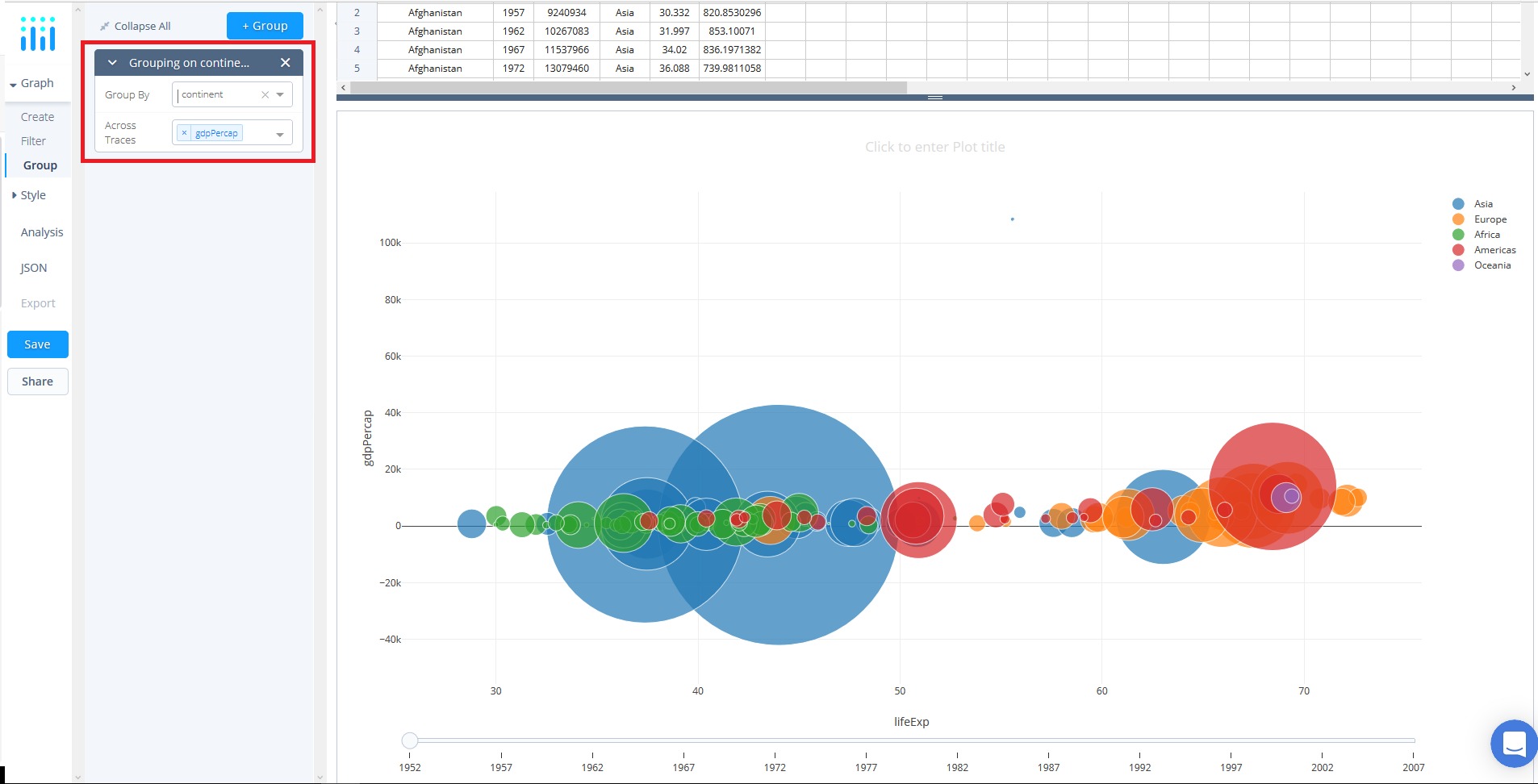
Now that we have filtered the data, you may notice that you have multiple traces - as we do in this dataset - that you wish to define. Here, we can utilize the group function. To do so, select 'group' under the 'Graph' tab and then click the '+ group' button situated at the top.
First, we need to select the variable we wish to groupby. In this tutorial, we will select continents by using the dropwdown in the grouping panel.
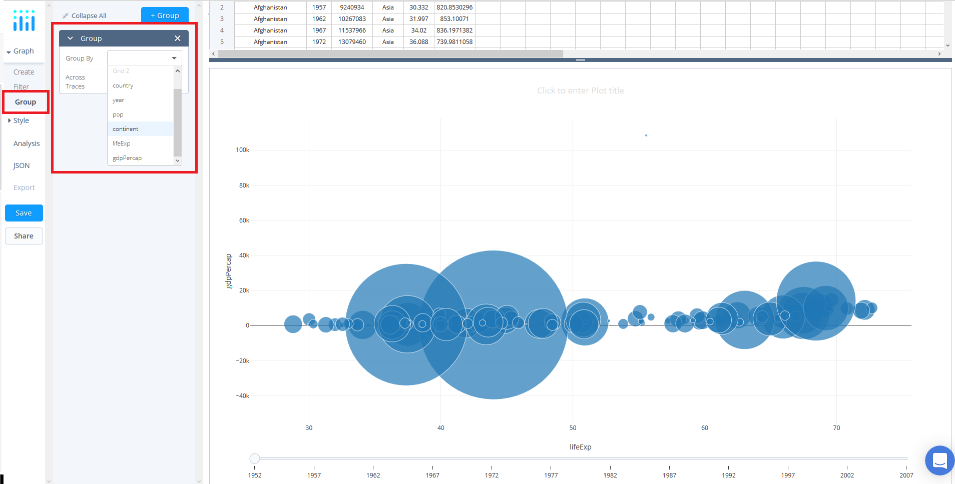
Second, we need to determine which traces we wish to apply the grouping across. Here, our Y value, gdpPercap, is selected by default. Notice that the groups are automatically colored according to Chart Studio's default color array - we will discuss how to alter these in the next section.
Style Your Chart
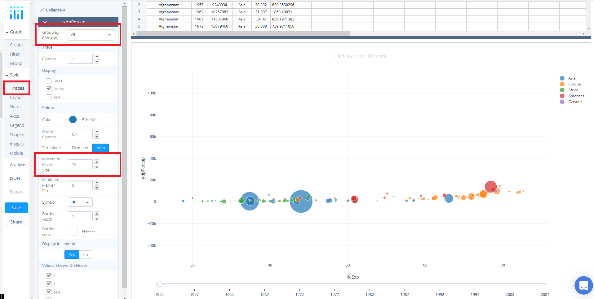
Concerning style, immediately we can see that we need to set better sizing for our markers. Here, navigate to 'Traces' under the 'Style' tab and set 'Maximum Marker Size' to 10.
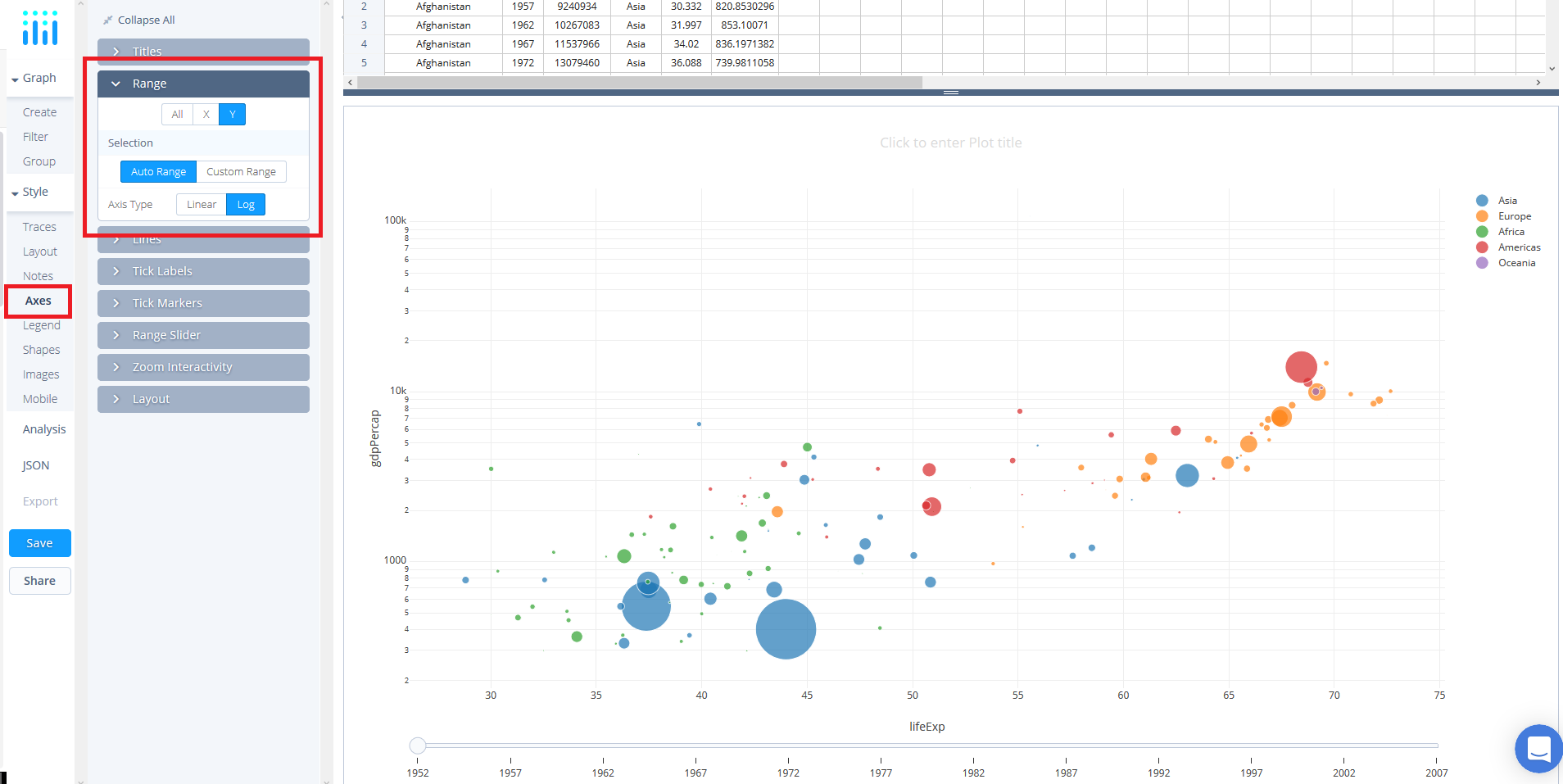
For this dataset, it'll be beneficial to apply a logarithmic scale to the y-axis. In the ‘Axes’ style tab, open the ‘Range’ panel and select ‘Y’ to apply changes to the y axis.
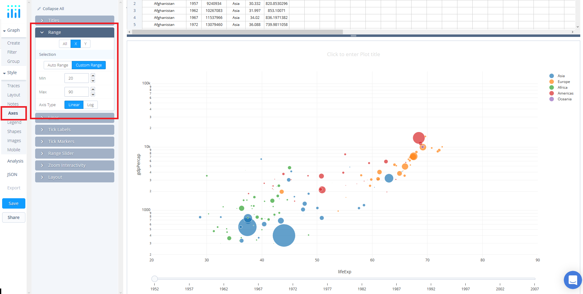
Also, because it is an animation it is best to apply fixed axes. To do so, remain in the ‘Axes’ style tab, open the ‘Range’ panel and select ‘X’. Click 'Custom Range' and enter the range 20 to 90. Likewise for the yaxis, enter 2.254045081589488 to 5.196555456217384.
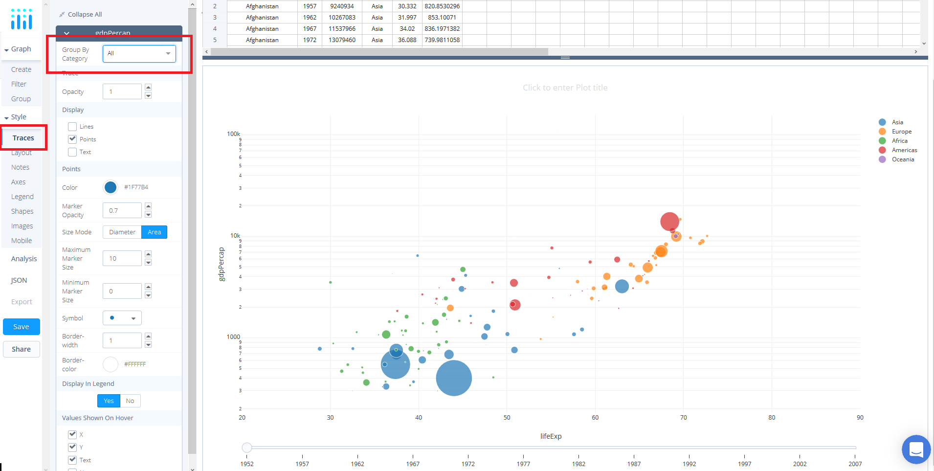
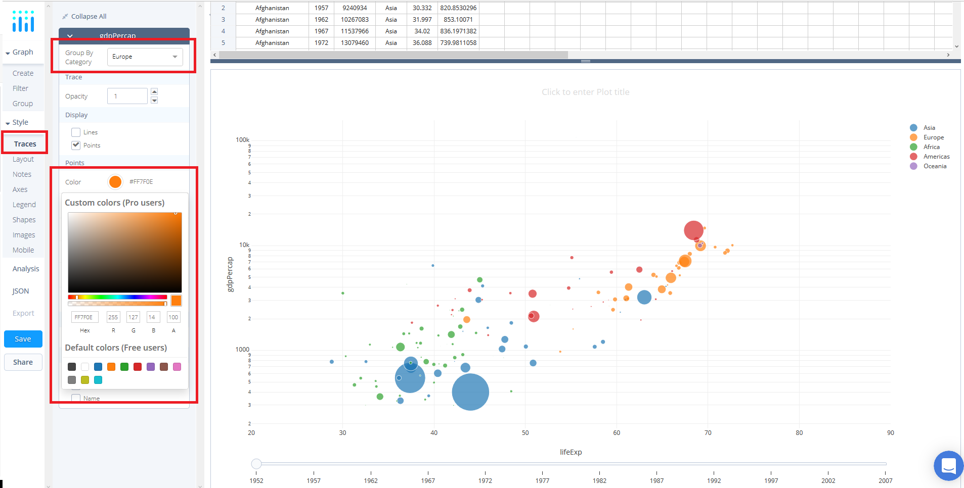
Now, we can style the individual continents that were separated when we used the group function. Navigate to 'Traces' under the 'Style' tab where you should see a dropwdown titled 'Group By Category'. Use this to style each category.
For example, select 'Europe' from the dropdown and click on the color dot to activate the color panel popup. Now, pick a color of your choosing. For the pupose of this tutorial we've left the default setting of orange.
Repeat this process for the remainder of the categories if you wish to change the colors - or apply any other trace stylings.

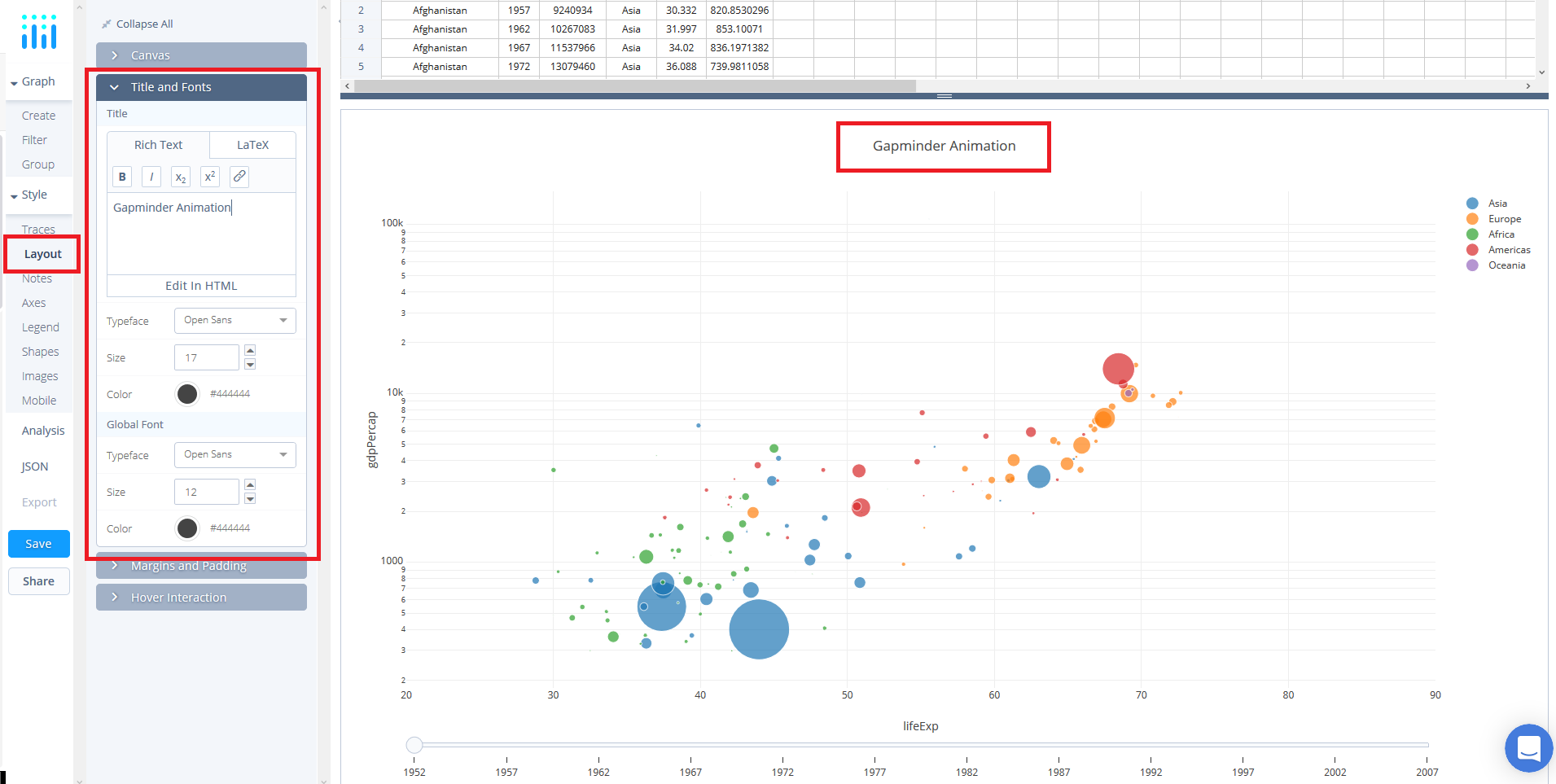
Lastly, add a title. Simply, click and edit directly on the plot at the title location. Alternatively, navigate to 'Layout' under the STYLE tab, select the 'Title and Fonts' panel and enter the title in the available textbox.
Save and Share
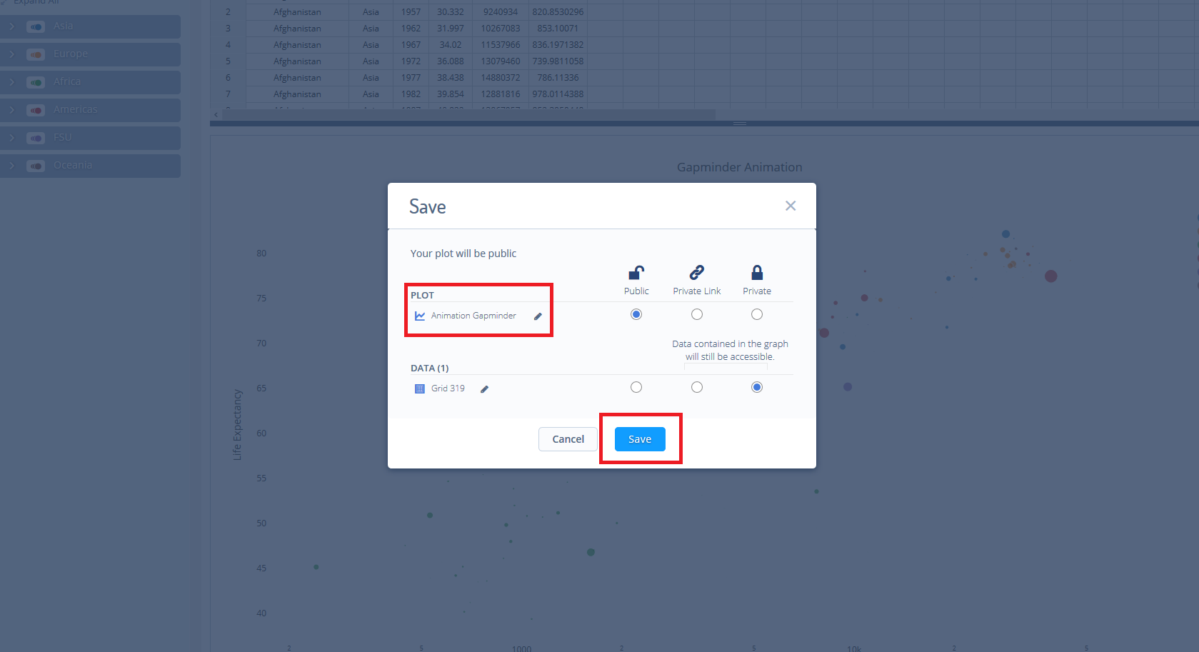
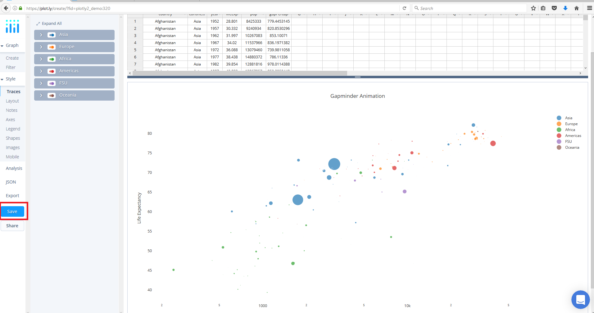
Your chart is now done! Click SAVE on the left-hand side.
After giving your file a name, select your PLOT and DATA as 'Public' or 'Private'. For more information on how sharing works, including the difference between private, public and secret sharing, visit this page.